Split Screen With Tabs

From WorkWithPlus 12 you will be able to use a new feature called "Split Screen With Tabs". This feature allows you to show in the same screen a grid with a list of records and next to it a visualization with the data regarding the selected item.

You can open at the same time many records and visualize all of them within different tabs:
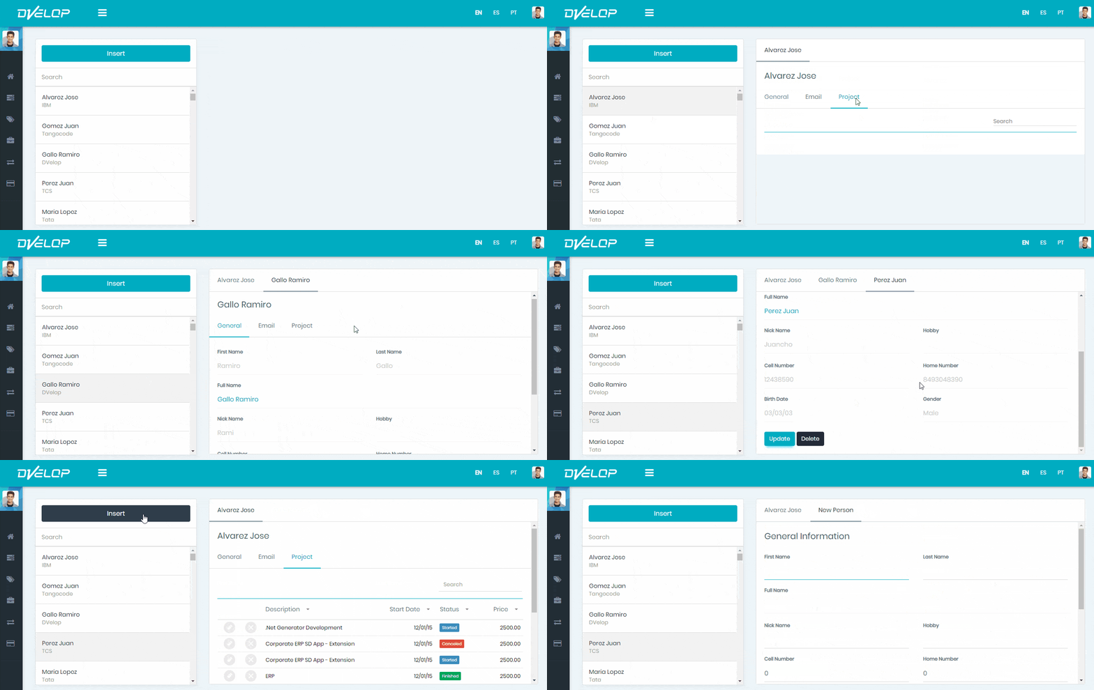
A running WorkWithPlus split-screen web application shows the DVELOP top bar with a language selector and user avatar, an Insert button, a Search field, and a list of sample contacts (Alvarez Jose/IBM, Gomez Juan/Tangocode, Gallo Ramiro/DVelop, Perez Juan/TCS, Maria Lopez/Tata) beside an empty detail panel.

In this way, you will be able to optimize the data shown in the screen. 

In order to use this kind of visualization, you should select the "Split Screen (with Tabs)" template when applying WorkWithPlus to a transaction:
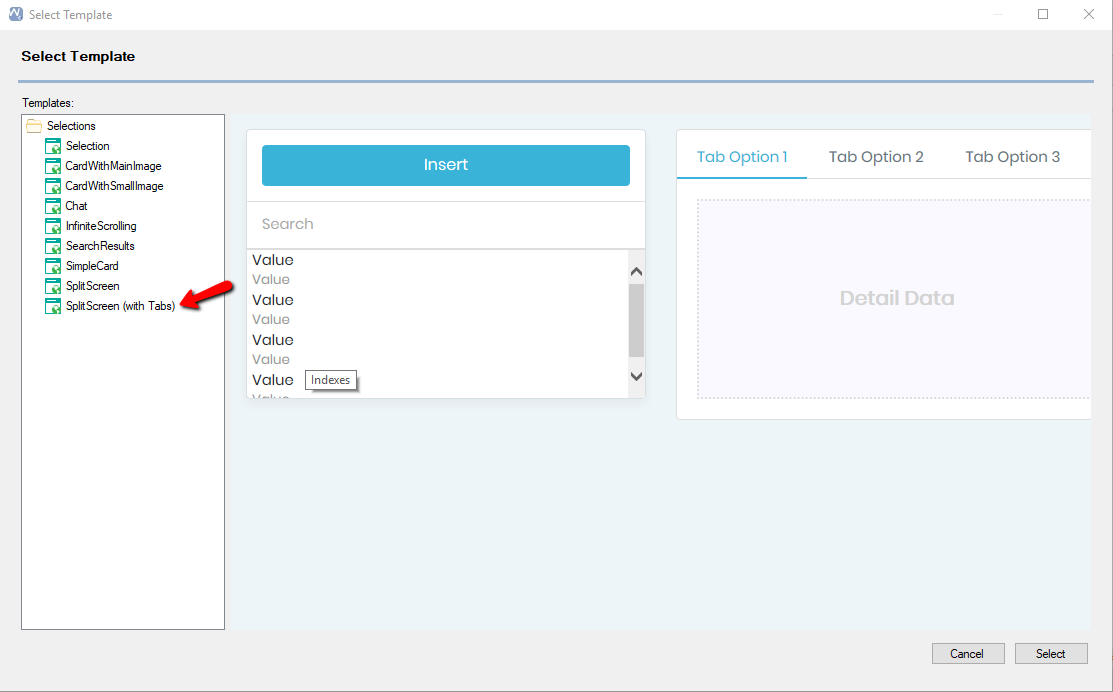
The Select Template dialog shows the SplitScreen (with Tabs) template highlighted with a red arrow in the Selections list; the preview displays an Insert button, a search list of Value rows, and a detail panel with Tab Option 1, Tab Option 2, and Tab Option 3 tabs above a 'Detail Data' placeholder.

You will notice that the generated WorkWithPlus instance is different from the ones generated by using other templates as it is specially designed for the "Split Screen With Tabs" feature:
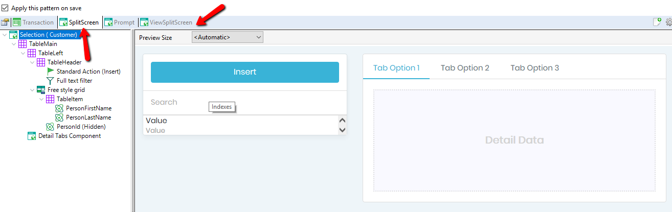
On the Work With Plus Patterns tab for a Customer selection using the SplitScreen (with Tabs) template, red arrows point to the SplitScreen and ViewSplitScreen buttons; the tree shows TableLeft with a Free style grid (PersonFirstName, PersonLastName, hidden PersonId) and a Detail Tabs Component, with the preview showing an Insert button, search box, and a detail panel with Tab Option 1/2/3 tabs and a 'Detail Data' placeholder.

You can customize this instance (the SplitScreen Selection and the ViewSplitScreen) as you usually do in WorkWithPlus. For example, you can change the attributes displayed in the Grid:
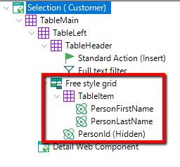
A zoomed detail of the Selection (Customer) pattern tree highlights, in a red box, the Free style grid node containing a TableItem with attributes PersonFirstName and PersonLastName plus a hidden PersonId, positioned above the Detail Web Component node.