|
With the aim of improving the way to visualize the data in fields, in WorkWithPlus 12 was included a new type of combo. This is the DVelop Combo.
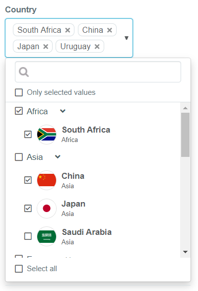
With this control you will be able to create combos with different categories inside as a TreeView, and the possibility to search in these data.
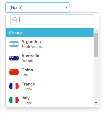
You can use this type of control in attributes and variables. You only need to change the properties "Control Info" and "Control Type":
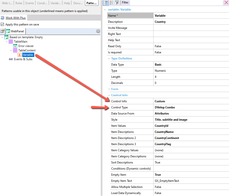
Then, you must configure the source from where the data will be loaded. The options are: Attributes, Data Provider, Fixed values and User code:
You can specify:
- "Style" **
- "Item Values".
- "Item Descriptions" (it's optional. If you choose a value that is NOT 'Regular', it corresponds to the Title).
- "Item Descriptions 2" (Depends on 'Style', it is the Subtitle value) **
- "Item Descriptions 3" (Depends on 'Style', it's the Image value) **
- "Sort Descriptions" or not.
- "Load Data Dynamically" or not.
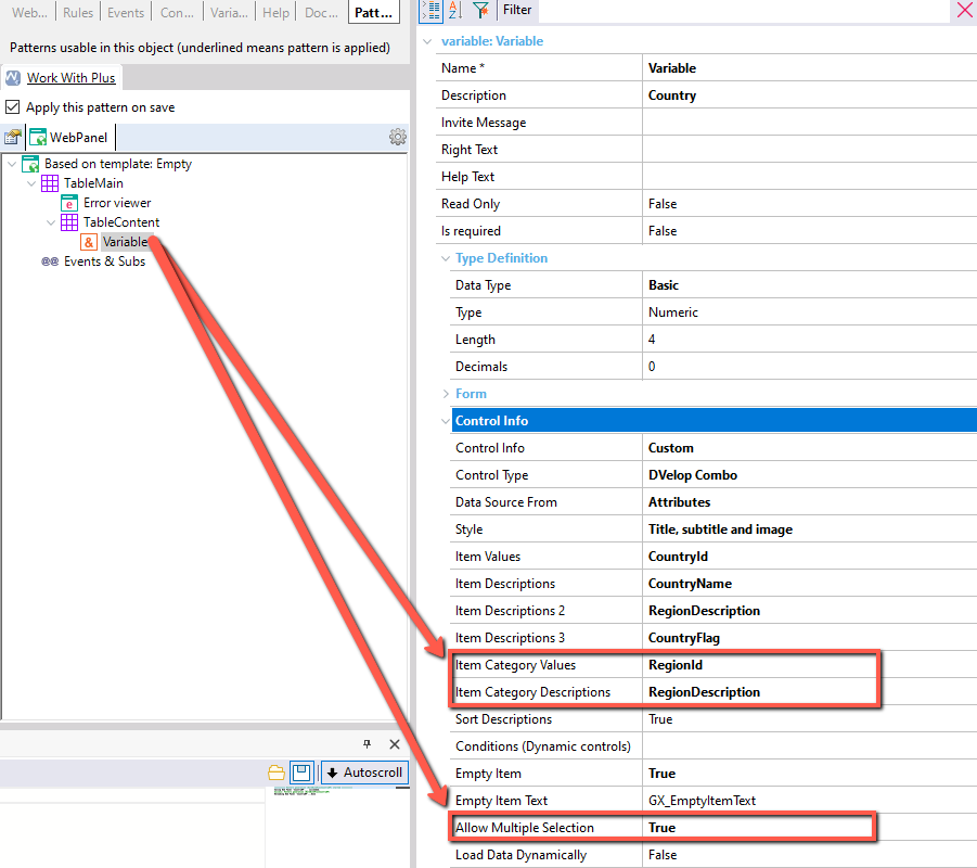
- "Item Category Values" and "Item Category Descriptions" (in order to get the records categorized by another attribute).
- "Allow Multiple Selection" or not.
If you set an "Item Category Value" and the "Allow Multiple Selection" property the definition is as follows:
At runtime, you will see the combo like this:
There are two possible situations:
-
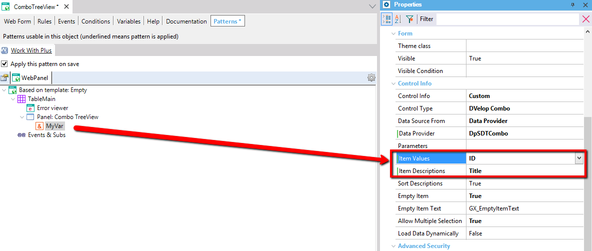
Load a Data Provider with a custom SDT, as follows:

In this case, you need to assign "Item Values" and "Item Descriptions", and the DataProvider which loads it in the property "Data Provider". This case will only support one level Data (multiple or single selection).
Like this Data Provider:
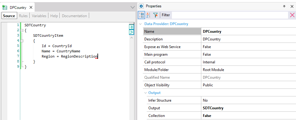
You need to define a variable as follows, for that, change the property of the DVelop Combo 'Allow Multiple Selection = True':
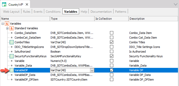
Add the variable to the instance and modify the following properties values:

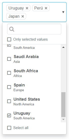
At runtime it will look as follows:
-
Load a Data Provider using WorkWithPlus's SDT associated to DropDownOptions:

If you load your data using this SDT, you can display multiple levels, depending on the children added to de DataProvider.
For example, the following Data Provider will have 2 levels:
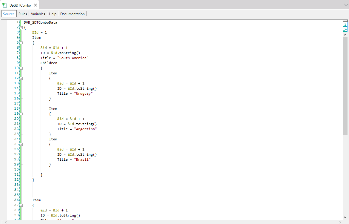
At runtime it will look as follows:
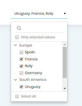
With this mechanism you could set N levels.
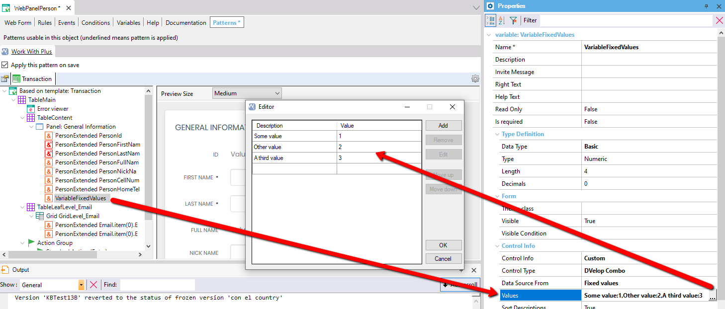
The third option of "Data Source From" is Fixed values. This means that you will define the values of the combo in the property 'Values'.
The last option of "Data Source From" is User code. This means that you will have to assign the values for the variable displayed on the form.
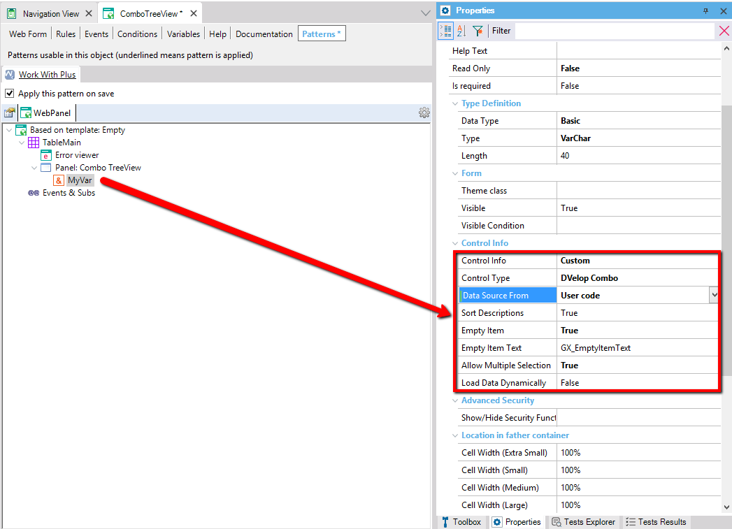
Then, it is needed to add the code in the subroutine to load the data (at the beginning):
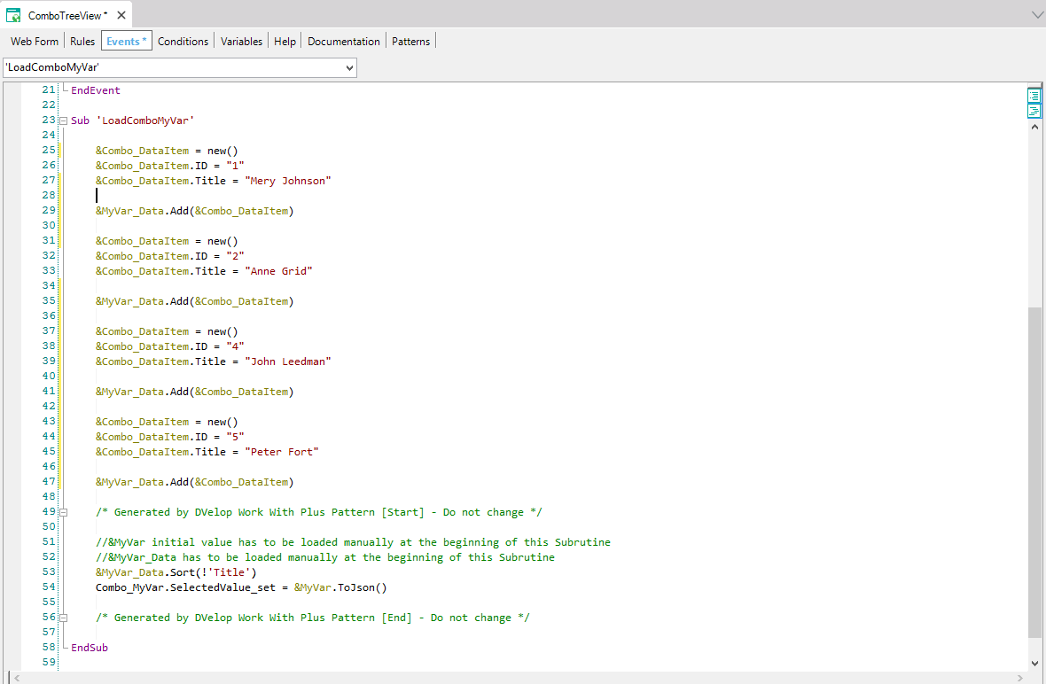
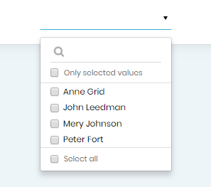
And at runtime it will look like follows:
In WorkWIthPlus 13, we can insert a new record of the items displayed in the DVelop Combo.
In order to do this, we need an attribute as Dvelop Combo.

First, we can create a new Web Panel with the template 'Data displayed popup' based on the business component transaction (in this case the AssuranceCompany transaction). You can also use the transaction itself, but it is better if the transaction is designed for popup (width, fields, etc).
Comment: The 'Data displayed popup' template is only available if you have run the Design System Wizard in WorkWithPlus 13. If you haven't imported a design in WorkWithPlus 13, the template won't be available, but you can create the Web Component by using any other template, it is not mandatory to use 'Data displayed popup' template.
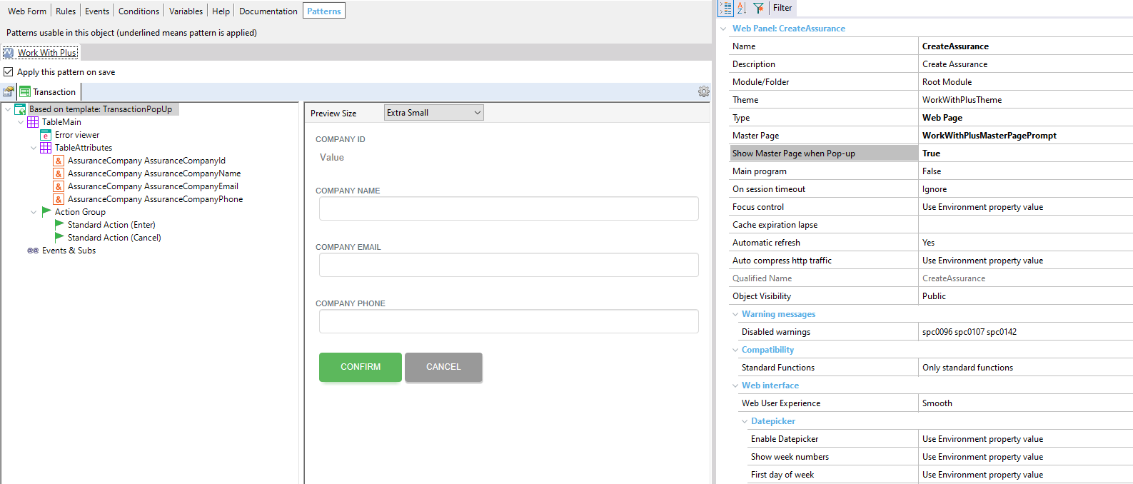
This Web Panel needs to have the property 'Support DVelop Combo Insertion' as true, so that inmediately after creating the new record, it is assigned automatically to the attribute/variable which contains the DVelop Combo.
In the attribute Dvelop Combo, add the panel created.
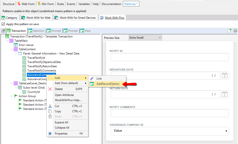
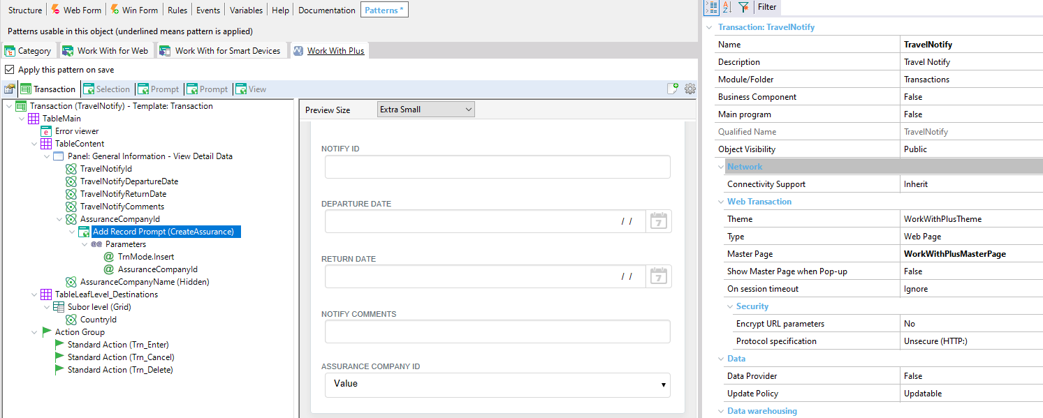
At runtime, it looks as follows:
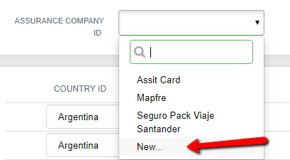
If you want that when you search for some record and press in the 'New' option, what you searched is filled automatically in the popup Web Panel, you need to follow the steps mentioned in the link below: How to: preset some field in 'New' option of DVelop Combo
You can filter the records that are displayed in some 'DVelopCombo' associated to a dynamic attribute or variable in a simple way.
Example: insert one Company and set the country and city. The city field needs to display only cities from the selected country.
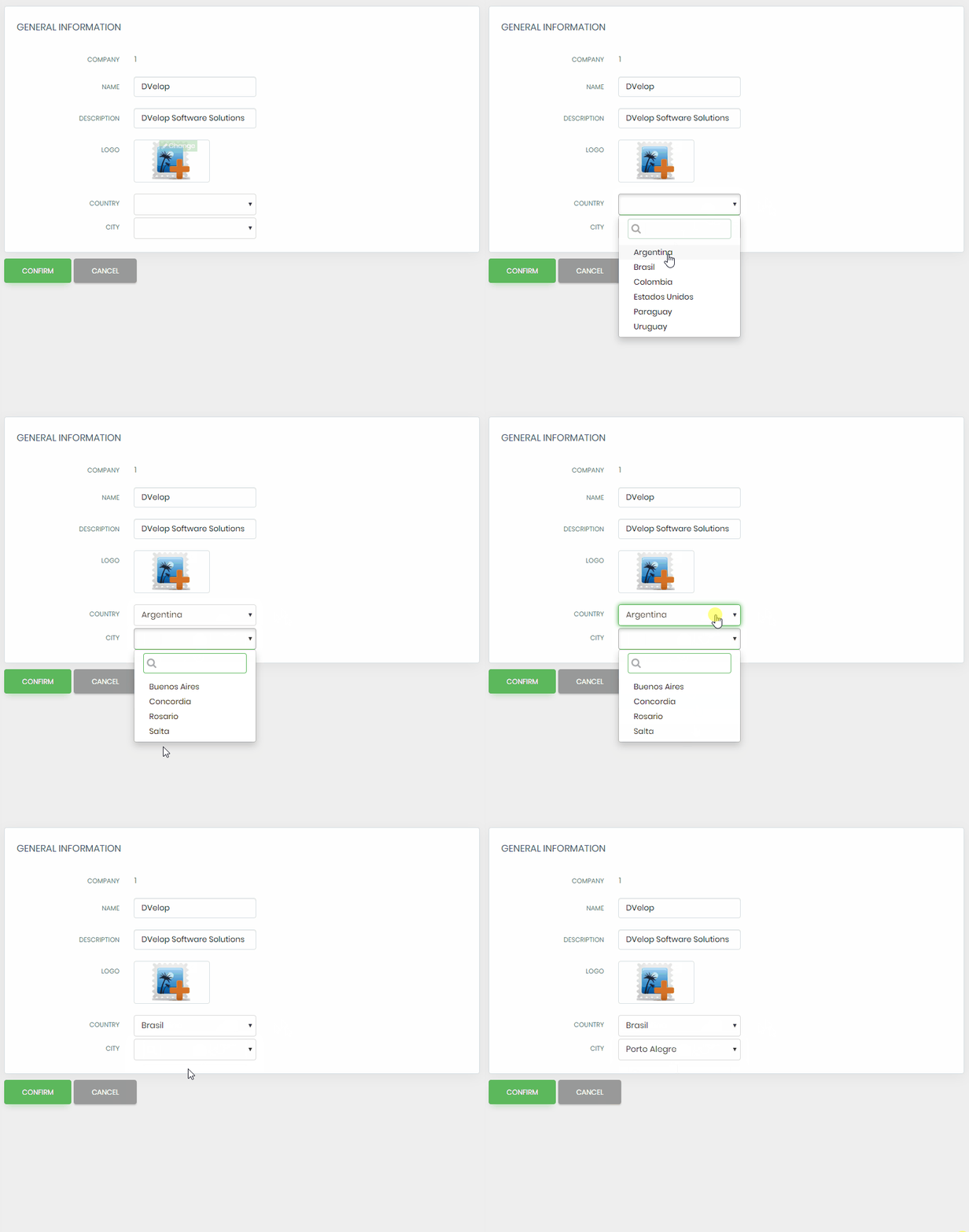
In order to do this:
- The control has to have the property 'Load Data Dynamically' as True
- A new property named 'Conditions dynamic atts or vars' will appear. You need to select the attributes/variables that will have a condition associated to the control. WorkWithPlus will show you the name of the variable that you have to mention in the conditions
- In the property 'Conditions (dynamic controls)' you need to add the conditions associated to the control, mentioning the variable that WorkWithPlus showed you
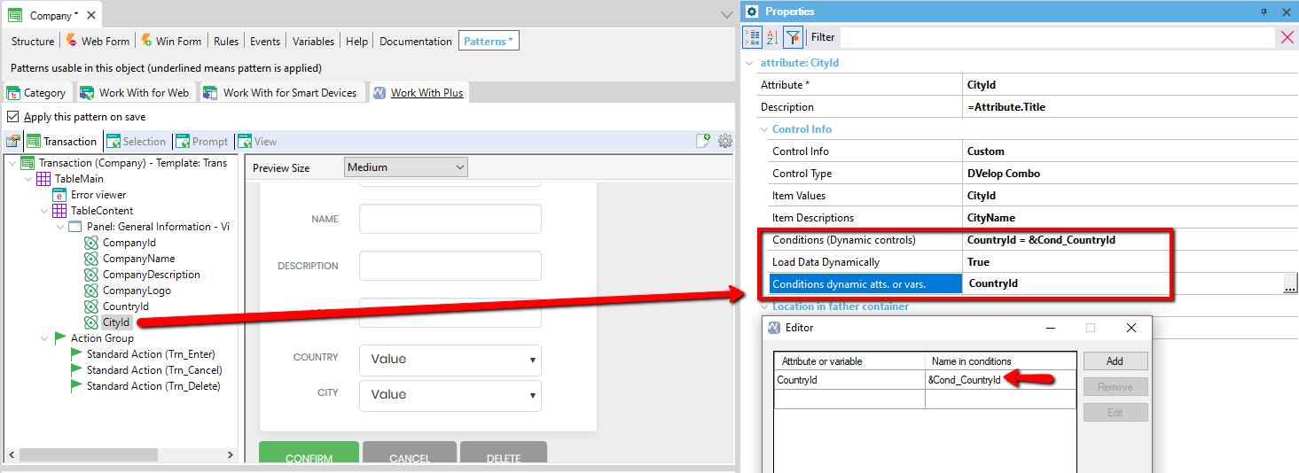
In the Example shown before:
- CityId is the control with 'DVelop Combo' (DVelop Combo)
- The dynamic attribute that is needed to use in the conditions is 'CountryId', so the variable to use in the conditions is '&Cond_CountryId'
- In the property 'Conditions (dynamic controls)', the condition added is
CountryId = &Cond_CountryId;
Important: you can read further information and scenarios about the DVelop Combo in the following link: Improvements in 'DVelop Combo' User Control
**Implemented since WorkWithPlus for Web 14.
|