Steps for Migrating a KB with WorkWithPlus from HTML to Responsive Web Design

This item shows the steps needed in order to migrate a complete KB that was developed using WorkWithPlus and generating HTML Web Design to a Web Responsive Web Design.

Step 1: Back up of the KB

Make a Backup of the KB in one of these ways:

  • XPZ of the KB
  • Make a copy of the root KB folder

Step 2: Mark all Instances as updated

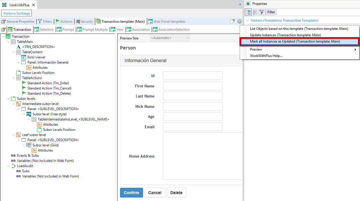
The WorkWithPlus Pattern Settings editor, Transaction template (Main) tab, shows the Transaction node tree (TableMain, TableContent, Panel Información General, Subor Levels Position, TableActions, Subor levels) alongside a live preview of a "Person" form with fields Id, First Name, Last Name, Nick Name, Age, Email, Home Address, and Confirm/Cancel/Delete buttons. A properties panel context menu on the right highlights the option "Mark all Instances as Updated (Transaction template: Main)" among List Objects based on this template, Update Instances, Preview, and WorkWithPlus Help.

After importing the new theme, you will need to do Update Instances (this is mentioned in a next step). Making 'mark all instances as updated' ensures that the only changes that will be applied to the instances when doing Update Instances will be the ones of the new templates.

Step 3: Import WorkWithPlus Theme

Select the Responsive Theme that you prefer, by clicking in Tools -> WorkWithPlus -> Import WorkWithPlus Theme:
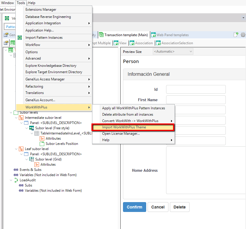
The GeneXus IDE Tools menu is open showing items Extensions Manager, Database Reverse Engineering, Application Integration, Application Help, Import Pattern Instances, Workflow, Options, Advanced, Explore Knowledgebase Directory, Explore Target Environment Directory, GeneXus Access Manager, Refactoring, Translations, GeneXus Account, and a WorkWithPlus submenu expanded with a red box highlighting "Import WorkWithPlus Theme" among Apply all WorkWithPlus Pattern Instances, Delete attribute from all instances, Convert: WorkWith -> WorkWithPlus, Open License Manager, and Help. Behind the menu, a "Person" transaction template preview is visible.

After selecting one theme, the following message will appear:
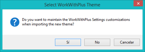
A "Select WorkWithPlus Theme" confirmation dialog asks: "Do you want to maintain the WorkWithPlus Settings customizations when importing the new theme?" with buttons Sí, No, and Cancelar.

WorkWithPlus gives you the possibility to maintain the WorkWithPlus Settings customizations that you had before importing the new theme. The properties/configurations that can be maintain are the ones that does not affect the look & feel of the Theme.

Some of them are:

  • All the properties within 'Labels' node
  • Generate Selection, Generate View and Generate Prompt
  • Configurations for Filters of each kind (character, numeric, etc.)
  • Among others that does not affect the look & feel of the new theme

So, if you press ´Yes´ those properties will be maintained, and if you press ´No´ all settings will be overwritten.
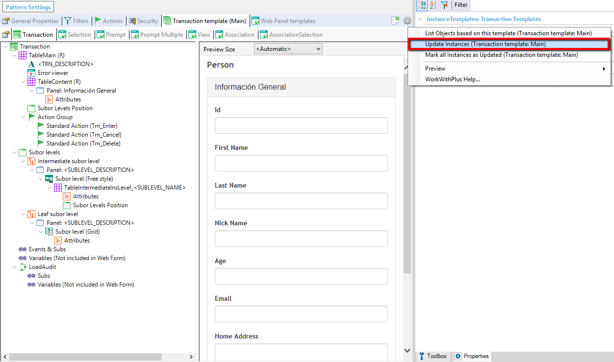
Step 4: Make Update Instances of Transaction Template and all the Web Panel templates:

In the WorkWithPlus Pattern Settings editor, Transaction template (Main) tab, the Transaction node tree shows TableMain (R) with an updated "Person" form preview (Id, First Name, Last Name, Nick Name, Age, Email, Home Address fields). A properties panel context menu on the right highlights "Update Instances (Transaction template: Main)" among List Objects based on this template, Mark all Instances as Updated, Preview, and WorkWithPlus Help.

The Update Instances process will migrate all the instances from the old look and feel (based on the previous templates) to the new one. This has to be done to the transaction template and to each Web Panel template.

Step 5: Analyze all the Web Forms of the application

It is necessary to check Web Panel by Web Panel that they have an appropriate look and feel. This can be done with the preview or at runtime.

Example 1: Displaying data in 2 columns

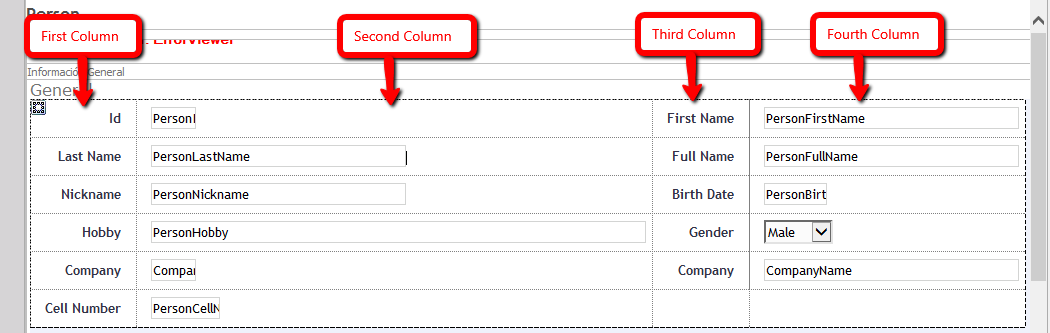
In order to display attributes in 2 columns in HTML design you have to set 4 columns to the table, as each attribute will occupy 2 columns (one for the attribute and another one for the description of the attribute):
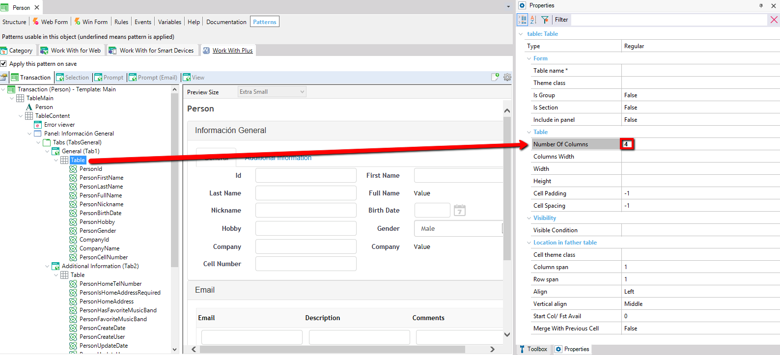
The Person transaction's Patterns tab (Work With Plus applied) shows the object structure tree on the left with the "Table" node selected under General (Tab1), and on the right a Properties panel for "table: Table" with "Number Of Columns" set to 4, highlighted with a red box and an arrow pointing from the tree to the live Person form preview showing a two-column General/Additional Information layout with fields like Id, First Name, Last Name, Full Name, Nickname, Birth Date, Hobby, Gender, Company, Cell Number.

A close-up of the Person form's Información General panel with four red callout labels "First Column", "Second Column", "Third Column", and "Fourth Column" pointing arrows down to the corresponding form fields: Id/PersonId, Last Name/PersonLastName in column one and two, and First Name/PersonFirstName, Full Name/PersonFullName in columns three and four, illustrating a 4-column table layout.

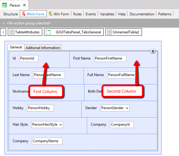
In Abstract layout, each attribute contains a description included, so each attribute will occupy just one column. This is the reason why you would have to analyze all the tables that contains 2 or more columns, because you should change the number of columns to it (dividing among 2 the actual number of columns). In the example above you should change the number of columns to 2.
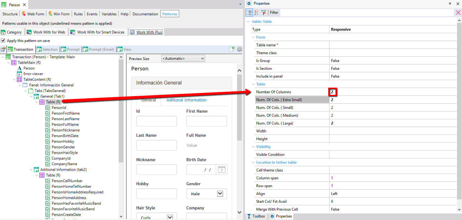
The Person transaction's Patterns tab shows the object tree with node "Table (R)" selected under General (Tab1), and a Properties panel for "table: Table" (Type Responsive) with "Number Of Columns" set to 2 highlighted in red, along with responsive breakpoint settings Num. Of Cols. (Extra Small/Small/Medium/Large) all set to 2. An arrow points from the tree to the live Person form preview showing a responsive two-column layout with General and Aditional Information tabs, fields Id, First Name, Last Name, Full Name, Nickname, Birth Date, Hobby, Gender, Hair Style, Company.

The Person transaction's Web Form editor shows the General/Additional Information tabbed layout with fields Id, First Name, Last Name, Full Name, Nickname, Birth Date, Hobby, Gender, Hair Style, Company, arranged in two columns. Red callout labels "First Column" and "Second Column" with arrows point to the Nickname and Birth Date row, indicating the layout's column boundaries.

Example 2: Attribute occupying more than a column

In order to set that some attribute occupies more than one column in HTML design you have to use the Column Span property:
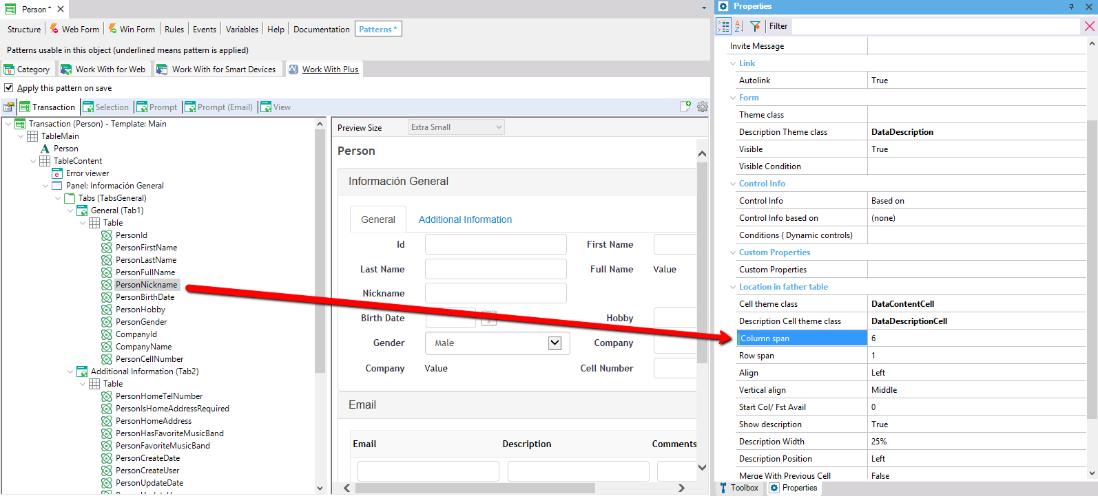
The Person transaction's Patterns tab shows attribute PersonNickname selected in the object tree, with the Properties panel on the right displaying its Column span set to 6 (highlighted), plus Row span, Align, Cell theme class DataContentCell, Description Theme class DataDescription, and other layout properties. A red arrow points from the tree entry to the Nickname field spanning the width of the Person form preview.

In Abstract Layout, in order to achieve this you have to use the property Cell Width of the size that you want to configure (for example Small):
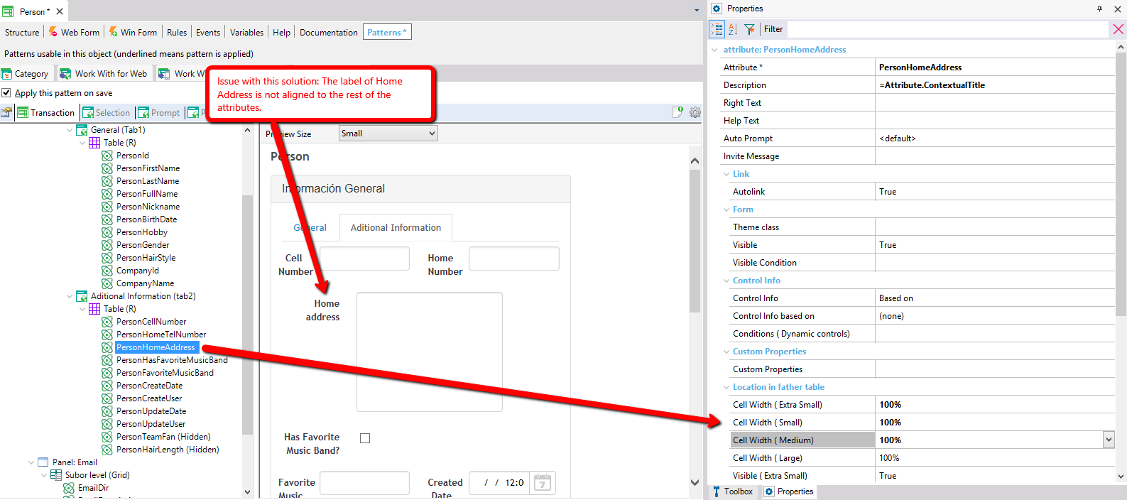
The Person transaction's Patterns tab shows attribute PersonHomeAddress selected in the object tree, with a red callout: "Issue with this solution: The label of Home Address is not aligned to the rest of the attributes." An arrow points from the tree entry to the misaligned "Home address" label above its textarea in the Aditional Information tab preview. The Properties panel shows Cell Width (Extra Small/Small/Medium/Large) all set to 100%.

The problem of this solution is that the description 'Home address' is not vertically aligned to 'Cell Number' and to 'Has Favorite Music Band'. This is because by default (defined by GeneXus), the description of the attribute always occupies 25% of the width of that attribute, and 75% is for the attribute field.

In the case of Hobby and Favorite Music Band, these attributes are occupying 50% of the form, so the description occupies 25% of the space designated for that attribute (50%). This means that the description of 'Hobby' will occupy 12.5% of the width of the Form. However, Home Address will have 25% of the 100% of the width of the form. This is why it is not vertically aligned to the others description attributes.

In order to align them, we can change the width designated for the description of 'Home address', so that it coincides with the space designated for 'Cell Number' description and for 'Has Favorite Music Band' description, as we can visualize in the following image:
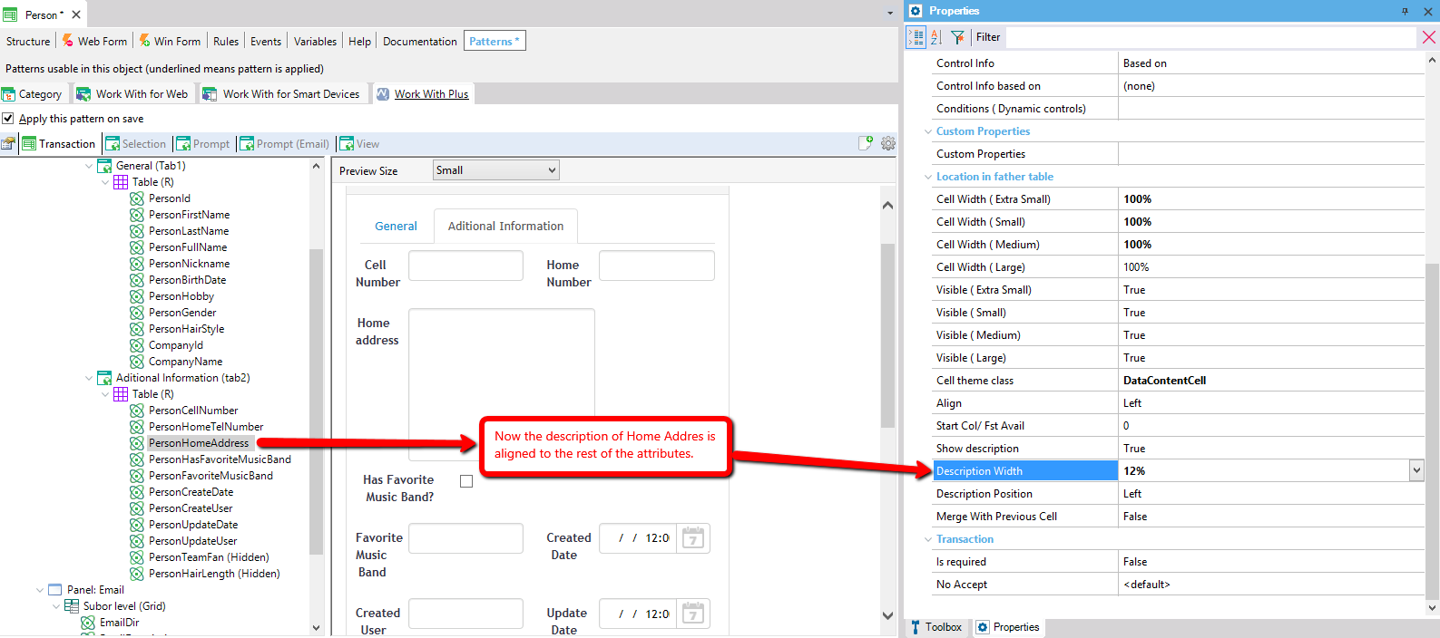
The Person transaction's Patterns tab shows attribute PersonHomeAddress selected, with a red callout: "Now the description of Home Addres is aligned to the rest of the attributes." An arrow points from the Description Width property (set to 12%, highlighted) to the properly aligned "Home address" label in the Aditional Information tab preview.

Step 6: Customize properties for the different browser's sizes

After migrating all the Web Forms of the application and verified that they have a perfect look and feel in the default browser size, you can customize the other sizes of browsers. For example, you can hide some controls for Extra Small, set a different width for small versus extra small or medium, etc.

So, this is made with the properties Visible and Cell width of the 4 different browser sizes:
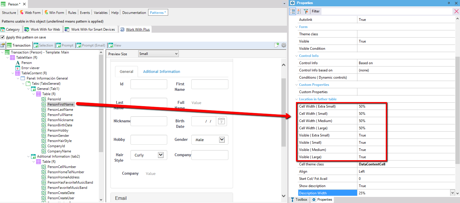
The Person transaction's Patterns tab shows attribute PersonFirstName selected, with the Properties panel highlighting Cell Width (Extra Small/Small/Medium/Large) all set to 50% and Visible (Extra Small/Small/Medium/Large) all set to True, in a red box. An arrow points from these properties to the First Name field in the General tab preview of the Person form.

The WorkWithPlus real time preview now will display a combo box that allows you to prototype the forms for all the browser sizes:
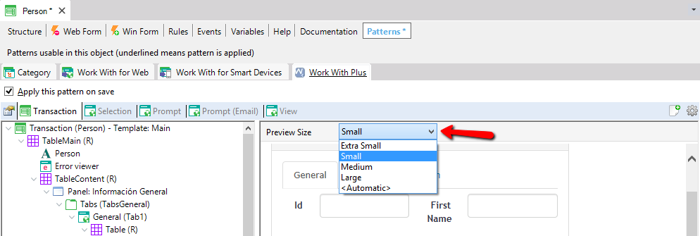
GeneXus IDE Patterns tab for a Person transaction with Work With Plus applied, Transaction sub-tab selected. A red arrow points to the 'Preview Size' dropdown, which is open showing the options Extra Small, Small, Medium, Large, and <Automatic>, with Small currently selected.

The table nodes within an instance has a new property named Type. This property defines whether the table will be responsive or regular. The responsive table was mentioned in the section Main Differences between HTML and RWD and the regular table will be drawing a TABLE element at runtime in the same way as it was done for HTML design.
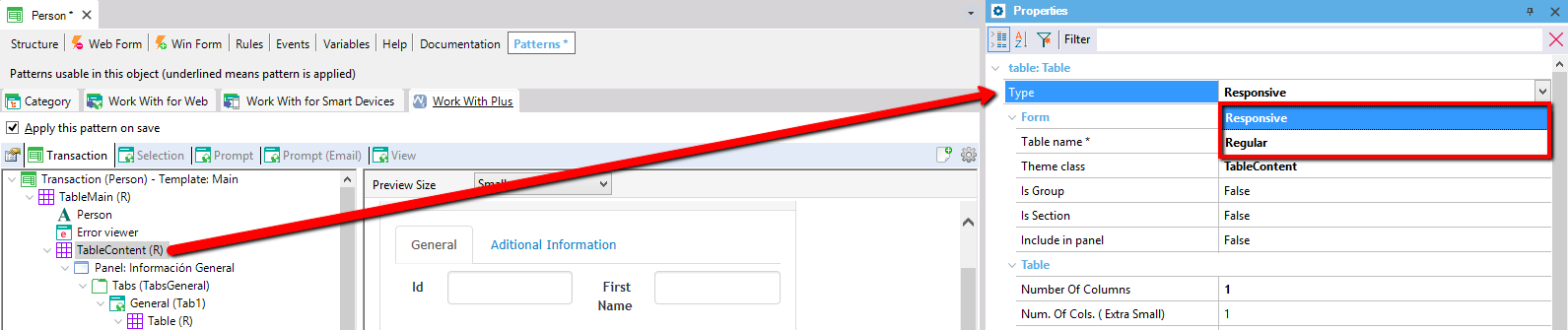
Person transaction Patterns tab with the TableContent (R) node selected in the tree; a red arrow links it to the Properties panel's table:Table section, where the Type property dropdown is open showing 'Responsive' (highlighted) and 'Regular' as options.

In addition, the UserTables (user zones) now have a new property type that has the following options: regular, responsive and HTML. If the UserTable was used for adding a user control inside, now the type property needs to be HTML. This is because in Abstract Layouts, the way that GeneXus supports adding user controls is adding them inside an HTML control.