Improvements in Charts

In SmartDevicesPlus 5 were included some improvements in Charts. Below are explained in detail.

"Pie Show Values" property:

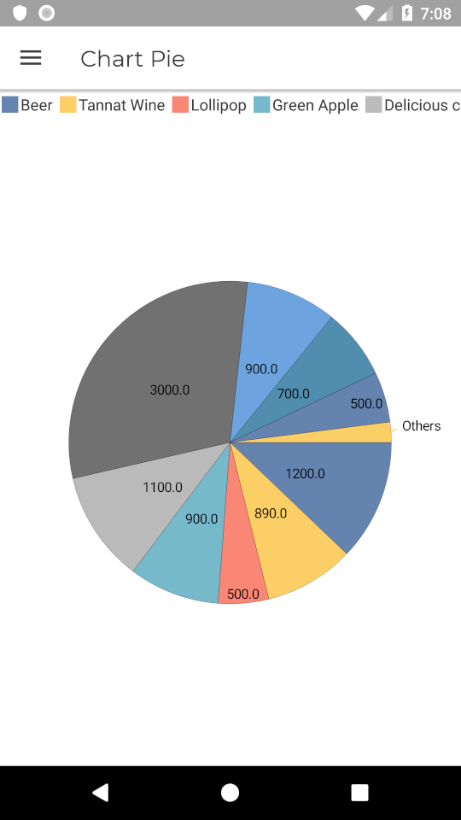
This property allows to show the values of the Series on the Chart. The possible values are:
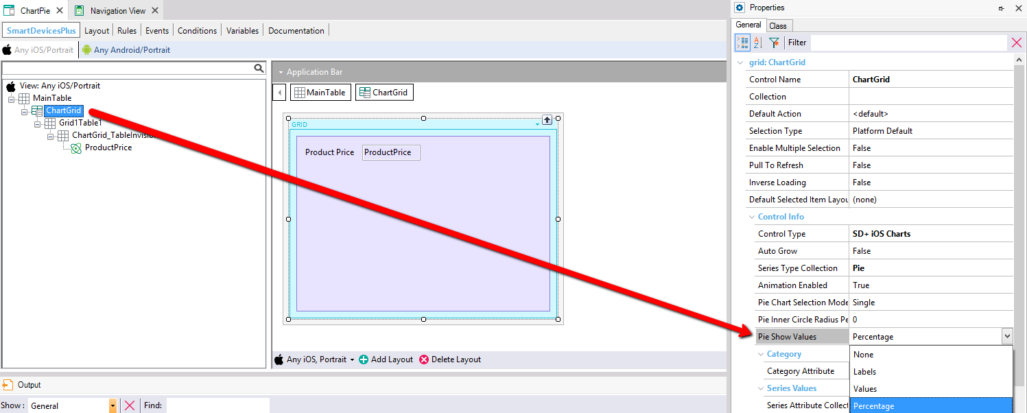
GeneXus IDE ChartPie object, Navigation View for Any iOS/Portrait, showing the ChartGrid node tree (Grid1Table1, ChartGrid_TableInvisible, ProductPrice) and a layout preview with a Product Price field; a red arrow points to the Properties panel's Control Info section for grid ChartGrid, highlighting 'Pie Show Values' set to Percentage, with Control Type 'SD+ iOS Charts' and Series Type Collection 'Pie'.

  • None.
  • Labels: show the label of the serie:
  • Values: show the value of the serie.

    Mobile app screen titled 'Chart Pie' displaying a pie chart with a legend for Beer, Tannat Wine, Lollipop, Green Apple, Delicious c... and other slices; each slice is labeled with its raw value (3000.0, 1200.0, 900.0, 1100.0, 900.0, 500.0, 890.0, 700.0, 500.0, and an 'Others' segment).
     
  • Percentage: show the percentage which occupy this serie.
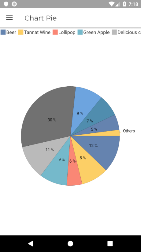
    Mobile app screen titled 'Chart Pie' displaying a pie chart with a legend for Beer, Tannat Wine, Lollipop, Green Apple, Delicious c... and other slices; each slice is labeled with a percentage (30%, 12%, 9%, 11%, 9%, 6%, 8%, 7%, 5%, and an 'Others' segment).

"Chart Value Marker Picture" property:

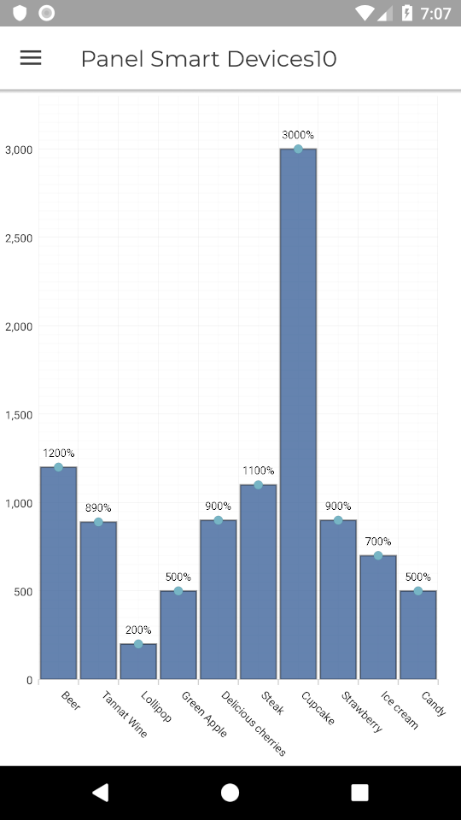
This property gives the possibility to add format to the Series Values. The supported format are the same of  the ones you can use in the "Picture" property of Genexus.
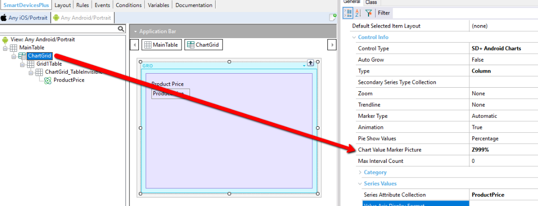
GeneXus IDE Navigation View for Any Android/Portrait, ChartGrid node selected in the tree (MainTable > ChartGrid > Grid1Table > ChartGrid_TableInvisible > ProductPrice) with a layout preview showing a Product Price field; a red arrow points to the Properties panel's Control Info section, highlighting 'Chart Value Marker Picture' set to 'Z999%', alongside Control Type 'SD+ Android Charts', Type 'Column', and Pie Show Values 'Percentage'.

Mobile app screen titled 'Panel Smart Devices10' showing a vertical bar chart across categories Beer, Tannat Wine, Lollipop, Green Apple, Delicious cherries, Steak, Cupcake, Strawberry, Ice cream, and Candy, each bar labeled with a percentage value (1200%, 890%, 200%, 500%, 900%, 1100%, 3000%, 900%, 700%, 500%).

Series Multiple with differents charts types:

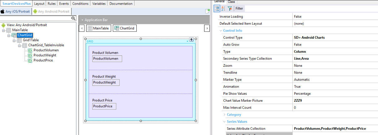
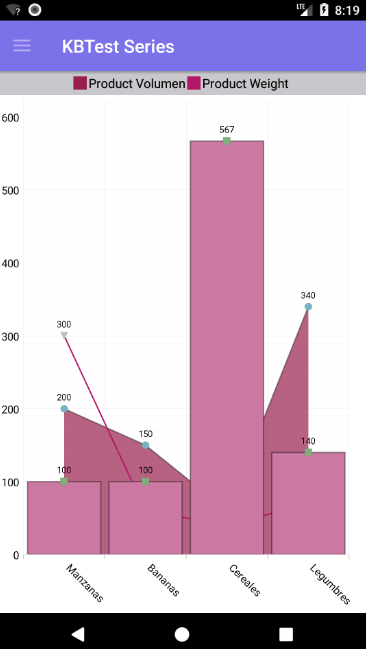
This behavior is achieved with the property "Series Type Collection". In this property you need to select the Chart Types which you want to combine.

The possible combinables series are: 

  • Area.
  • Column.
  • Line.
  • SPLineArea.
  • SPLine.
  • StepArea.
  • StepLine.

GeneXus IDE Navigation View for Any Android/Portrait, ChartGrid node tree showing ProductVolumen, ProductWeight and ProductPrice fields, with a matching layout preview of the three fields; the Properties panel on the right shows Control Info for the chart including Control Type 'SD+ Android Charts', Type 'Column', Secondary Series Type Collection 'Line,Area', Chart Value Marker Picture 'ZZZ9', and Series Attribute Collection 'ProductVolumen,ProductWeight,ProductPrice'.

Mobile app screen titled 'KBTest Series' with a combined bar-and-area chart comparing Product Volumen (bars) and Product Weight (line/area) across categories Manzanas, Bananas, Cereales, and Legumbres, with data labels 100/200/300, 100/150, 567, and 140/340 respectively.

Change Chart colors in iOS:

In this version is supported to change the color of the charts in this platform. This was already possible in Android.
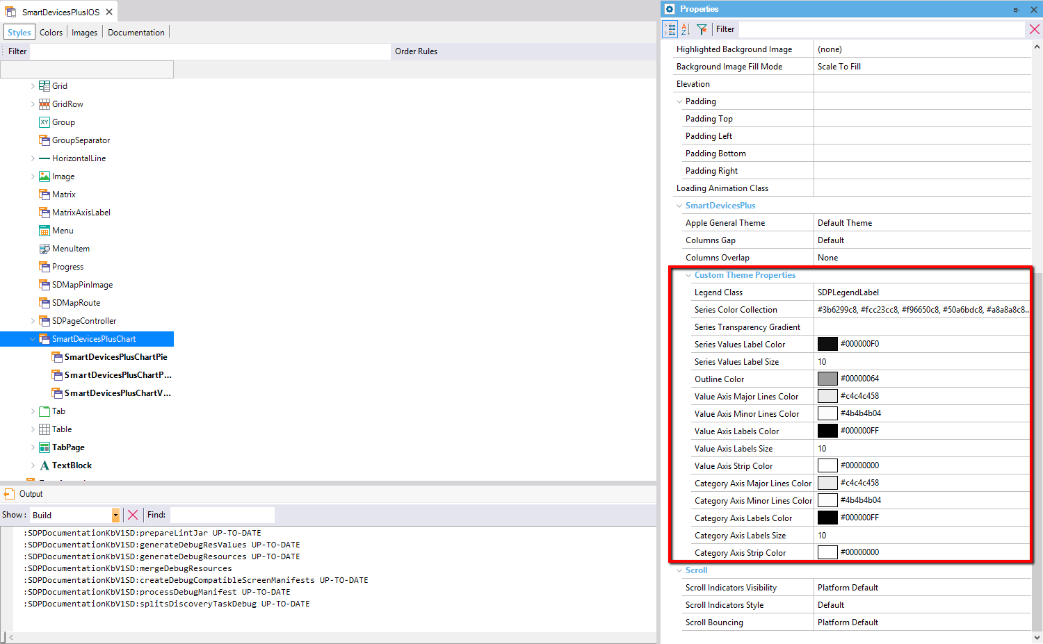
GeneXus IDE Theme editor 'SmartDevicesPlusIOS', Styles tab, with the SmartDevicesPlusChart node selected in the tree under SmartDevicesPlusPie/ChartP.../ChartV... entries; the Properties panel on the right shows the 'Custom Theme Properties' section highlighted in red, listing chart styling options such as Legend Class 'SDPLegendLabel', Series Color Collection (a list of hex colors), Series Values Label Color, Value Axis Labels Color, Category Axis Labels Color, and related size/color settings.