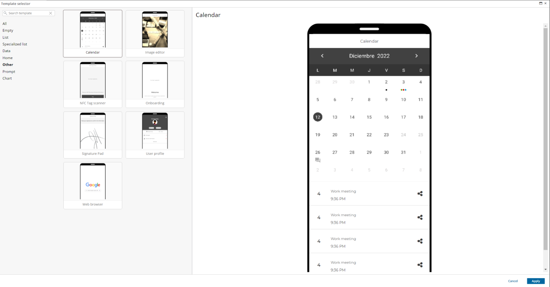
Calendar is a user control that can be used to create any screen that provides calendar and events functionalities.
WorkWithPlus for Native Mobile provides a template that will help create and set up any screen that uses this control.
The user control events are configured using the SDTs 'SDPlusCalendarInfo' and 'SDPlusCalendarEntry'.
An example of how to configure events on the calendar is provided in the template.
Users can configure color for each event, and also the icon that will be used to mark that day on the calendar.
To set the icon of the event, the 'status' field must be modified.
Status:
- 0: No Icon. In this case, color is used on the day's label. On Android, also, the text of the event is painted using the selected color.
- 1: A 'big dot' is drawn on the day, using the selected color. On Android, this option also writes the event text first letter inside the dot.
- 2: A 'small dot' is drawn on the day, using the selected color. This is the 'default' usage in iOS.
- 3: Three dots are drawn on the day. Colors can not be customized.
- 4, 5, and 6: Special icons used only in Android ('heart', 'paw' and 'conversation')
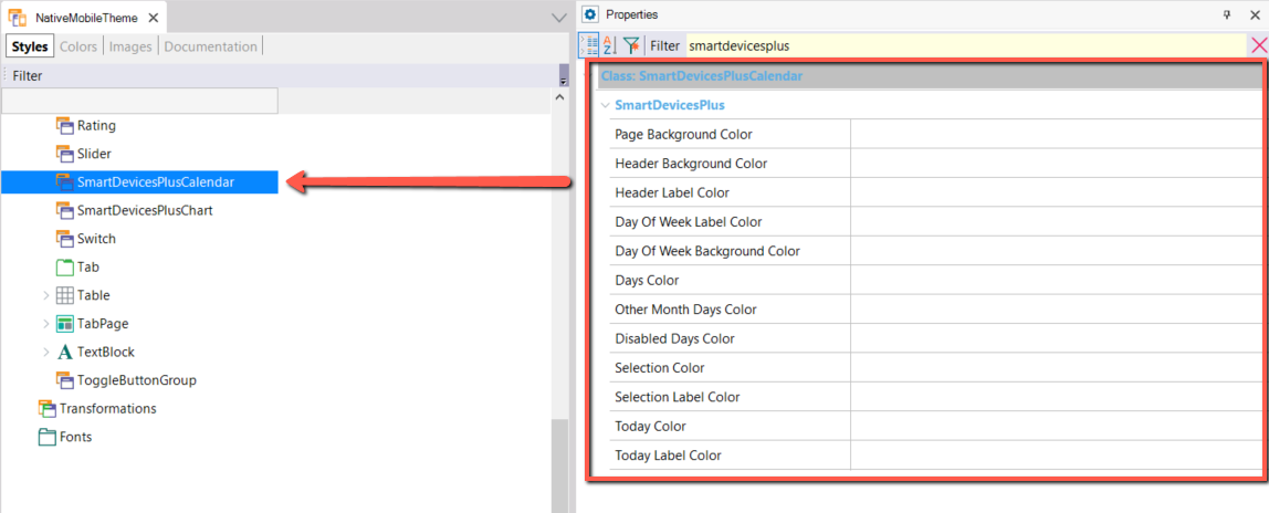
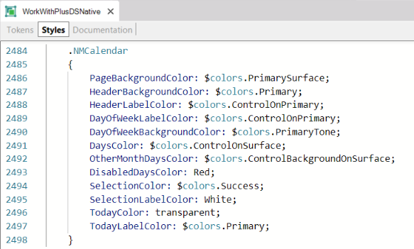
Also, Calendar colors and visual style can be customized using a custom theme class or style class.
| Theme Object |
Design System Object |
 |
 |
- PageBackgroundColor: Calendar background color.
- HeaderBackgroundColor: Header of the calendar, where the month, year and forward or backward arrows are shown.
- HeaderLabelColor: Color of the header text.
- DayOfWeekLabelColor: Color of the text of the initial letters of the day of the week, located in the header.
- DayOfWeekBackgroundColor: Background color of the days of the week.
- DaysColor: Color of the calendar day number.
- OtherMonthDaysColor: Color of the day number of months that are not the current one. (Android only)
- DisabledDaysColor: Color of the day number that is disabled. (Android only)
- SelectionColor: Background color of the selected day.
- SelectionLabelColor: Text color of the selected number.
- TodayColor: Background color of the current day (today).
- TodayLabelColor: Text color of the current day (today).
If you use Design System, we recommend making changes to the Design System objects created by the Design System Wizard inside the application folder, where you will find 3 Design System Objects, one for AnyPlatform, one for Android and one for Apple. Depending on which one you need to modify the colors for, add the NMCalendar(default) class and add the properties that you want to change the color.
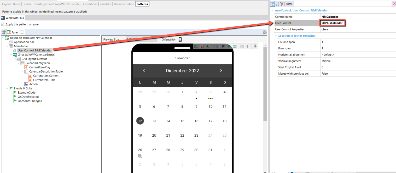
Additionally, the user control can be used in any Panel using a User Control named SDPlusCalendar.
Properties:
From the events you can change it with the following way:
<ControlName>.FirstDayOfWeek = "Monday"
Possible values:
-
Default
-
Sunday
-
Monday
-
Tuesday
-
Wednesday
-
Thursday
-
Friday
-
Saturday
For more information see: First Day Of Week Property
|