|
If you selected the "Customize" option in the Design System Wizard, a list of categories and their parameters will be displayed, for the currently selected Design.
You can move between categories any time you want, and once you are satisfied with your customizations, just click "Create App".
In this step, you will be able to modify basic application information, like object name, application title, color palette, font, icons, etc.
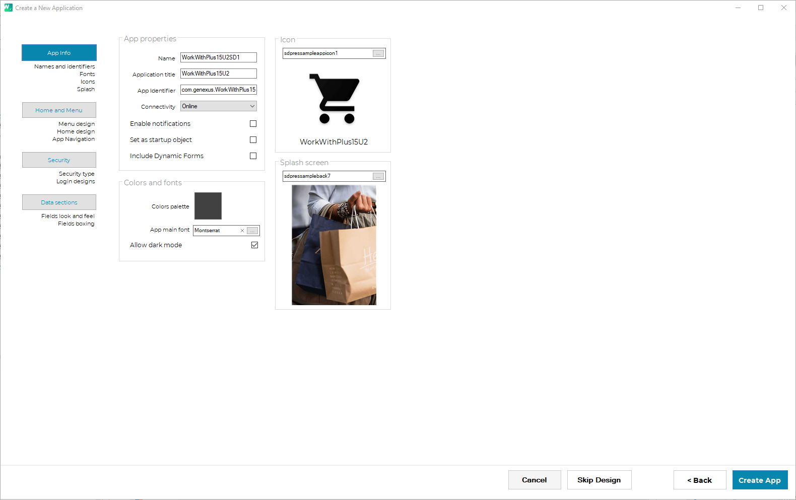
- Name: specify the name of the Main panel of your application. This panel will have the desired menu and the necessary code to load it. It will be set automatically as the Main Object of the Knowledge Base.
- App title: specify the title of your application. This setting defines the following GeneXus property: ApplicationTitle
- App identifier: specify the app identifier of the application. This setting defines the following GeneXus property: Apple Bundle Identifier.
- Connectivity: specify if your application will be Online or Offline. This setting defines the following GeneXus property: Connectivity Support
- Enable Notifications: specify if the Push Notifications will be enabled or not in the Knowledge Base.
In this category, you can specify the desired font for the application texts.
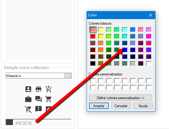
In this category, you can select the collection of icons that your application will have. In this way, you will have ready to use icons that can be used for the Menu items or in any part of the app where you may need it.
If the collection "Material.io" is selected, you will be able to select a specific color for it and so create customized icons for your app:
In this category, you can specify the Icon of your application. This setting defines the following GeneXus properties: Android Application Icon and Apple Application Icon.
In this category, you specify the Splash screen of your application. This setting defines the following GeneXus properties: Android Portrait Launch Image and Apple Launch Image.
In this step, you will be able to modify the menu and home designs, including the use of tabs, onboarding, etc.
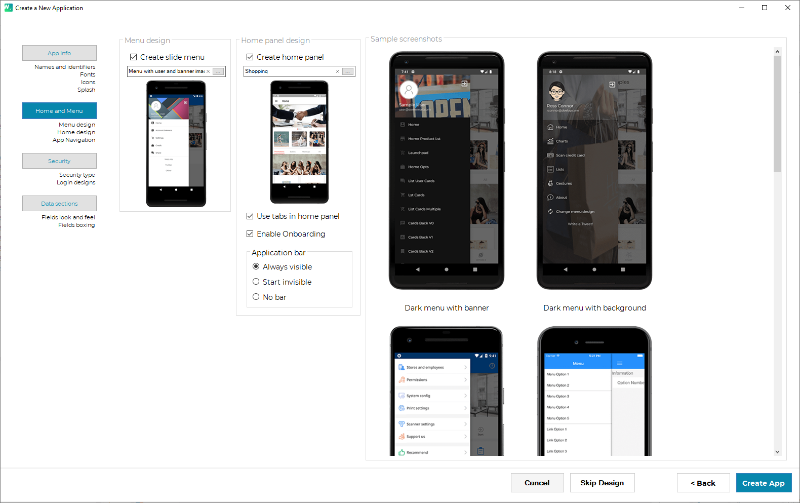
You can select whether the application will use a 'Slide Menu' or not.
In case the 'Slide Menu' is created, you can also select the design for your application's menu. When you click on this field you can visualize a preview of the possible designs and select one.
In this category, you can select whether the application will use a 'Home Panel' or not.
In case the 'Home Panel' is created, you can also select the design it will have. When you click on this field you can visualize a preview of the possible designs and select one.
If you select the "Use tabs un home panel" checkbox you will have tabs at the bottom of the Home layout defined previously.
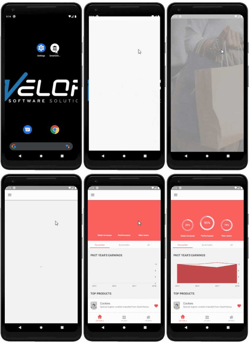
If enabled, WorkWithPlus for Native Mobile will create a sample onboarding panel, which the user will later be able to modify.
The onboarding panel is a panel that is only displayed the first time the applications are opened. Once the user closes this panel, it will not appear again unless the developer changes behavior.
e.g.:
First time application is opened:

Following times the application is opened:
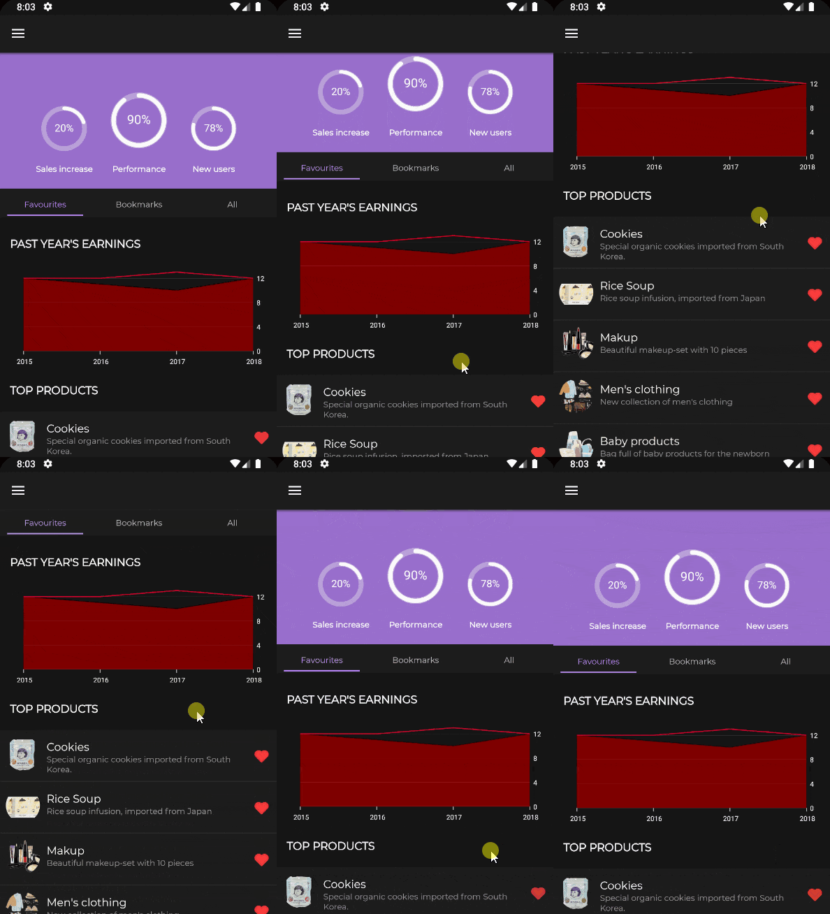
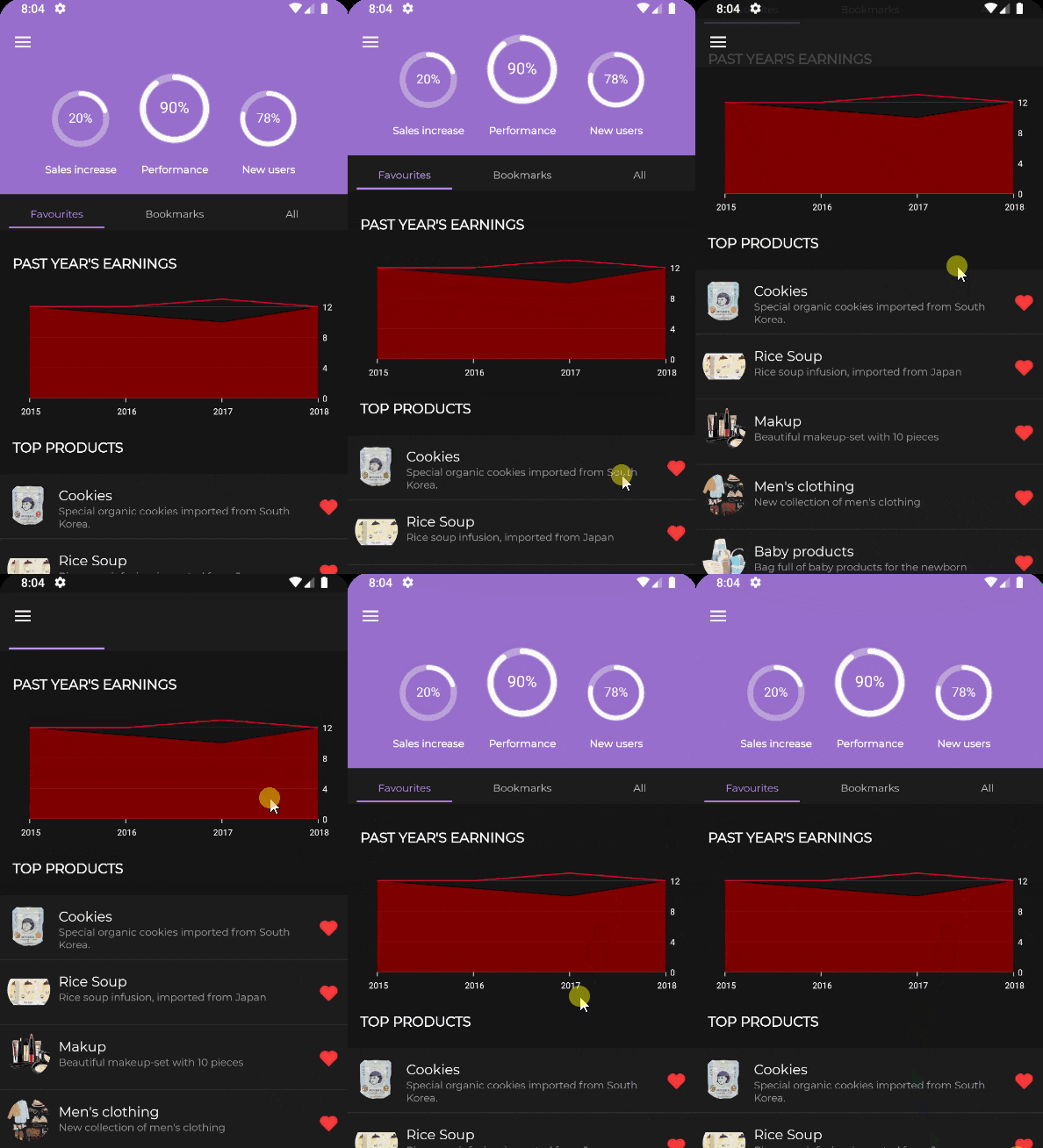
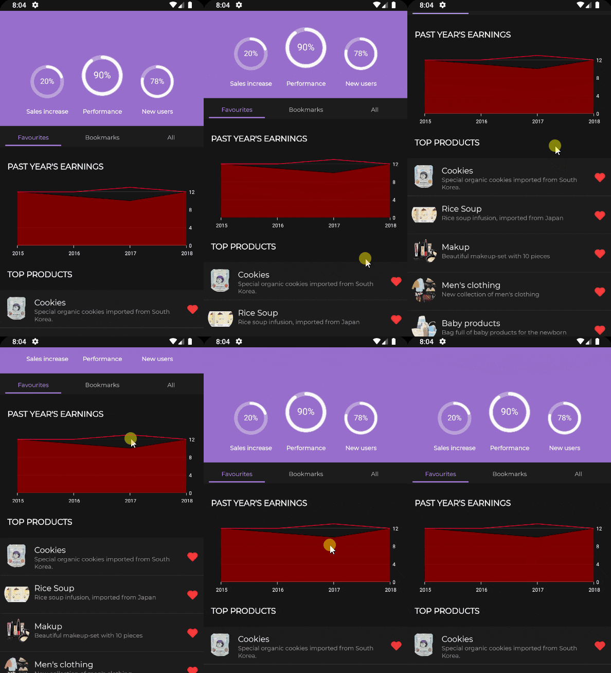
It allows the developer to define how the application bar will behave in the home panel:
|
Always visible
|
Start invisible
|
No bar
|
| The application bar is always visible. |
The application bar starts invisible, but as the user scrolls, it becomes visible. |
The application bar will not be displayed.
|
 |
 |
 |
In this step, you can define general Security customizations of your Knowledge Base.
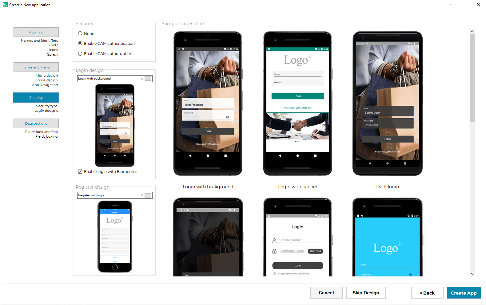
In this category, you define the type of security that the app will have. We strongly suggest using GAM in order to have a secure app. You can also select GAM type (authentication or authorization)
In this category, you can select the Login panel design that your application will have by default. When you click on this field you can visualize a preview of the possible layouts and select the one that satisfies your requirements.
In addition, the property 'Enable Fingerprint Login' defines if this login will have the possibility to use the Fingerprint reader of the device. If you set this property to "True", WorkWithPlus for Native Mobile will generate the necessary code into the login panel to use the DeviceAuthantication External Object automatically.
In this category, you can select the Register User panel design that your application will have by default. When you click on this field you can visualize a preview of the possible layouts and the one that satisfies your requirements.
In this step, you can define general Security customizations of your Knowledge Base.
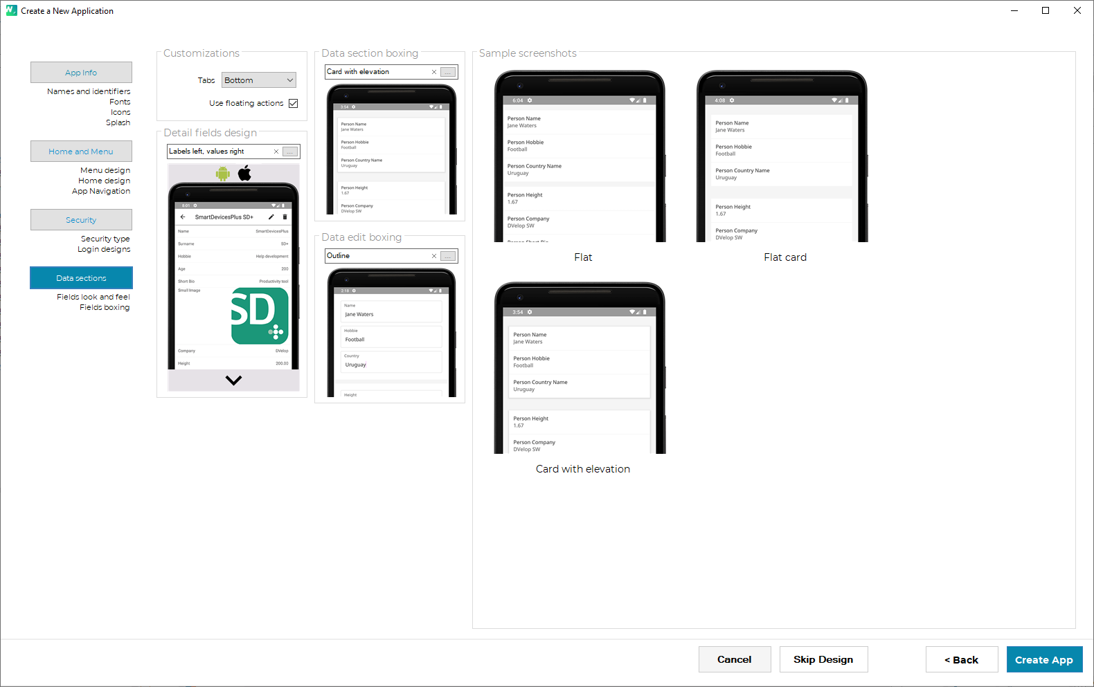
In this category you can select the position of the Tab control when it is present in a Panel. Two options are available: Bottom and Top.
The 'Use floating actions' checkbox, if checked, will include in the listings an Action Group with another Action Group inside, which will be of type 'Floating'.
In this category, you can select the detail field's layout that your application will have by default. When you click on this field you can visualize a preview of the possible designs and select one.
In this category, you can define how the section data will be displayed. A data section is a group of one or more fields.
In this category, you can define how individual fields will be displayed in edit mode panels
|