
The purpose of Selection node is to generate the WorkWith object associated to the transaction.
Selection node has the following properties:
Specifies the title that will be set to the Selection object's web page. If we want to set certain fixed value to it we must recover the value with the symbol '. For example: if we want to show Persons as the title of the form, we must set 'Persons'. If this property is empty, the webpage's title will be taken from Description property of Selection node.
Specifies description's node, but it will not assign it to the property Description of the object. It is used by the Work With Link nodes of View object, when its Caption property is blank.
Specifies the paging type of the Grid in this Selection. The options are:
- One page at time.
- Infinite Scrolling (form scroll bar)
- Infinite Scrolling (grid scroll bar)
Specifies the number of rows per page that its grid will display. This property can be '<default>', '<unlimited>', 'Page.Rows' or directly the number of rows that we want the grid to display. If this property is '<default>' then the value will be taken from WorkWithPlus Configuration > Grid node > property Page. If this property is '<unlimited>' the grid will not have paging (all records will be displayed within a grid page).
Define when to load the grid of a List object.
There are three possible values:
-
This is the behavior for previous versions of WorkWithPlus for Web and loads the data from the grid when entering the page as shown. Also, this is the default value for this property.
-
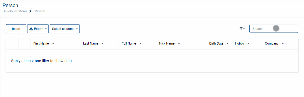
When we have the Load Data property with 'After filtering', when entering the page, the grid will not load, it will do so after we perform a search in our filters. If you clean all the filters, the grid will return to the initial state (empty).
-
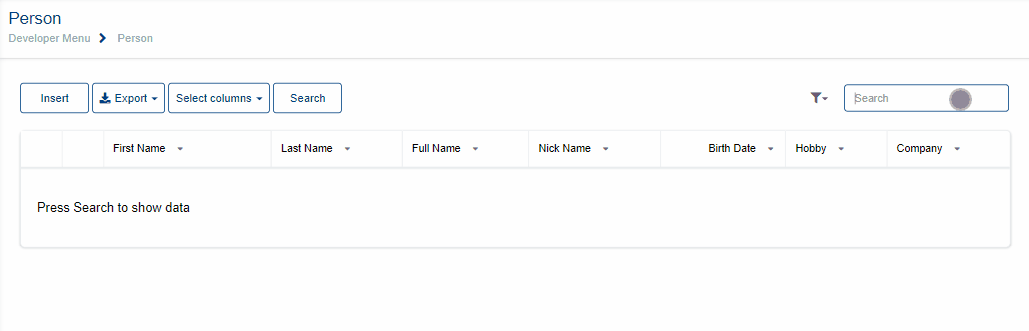
The second option that was added is 'After press Search button'. For this it is necessary to have the Standard Action Search on the page, then, after inserting some data in a filter, press the Search button to load the grid applying the filters fulfilled. If you clean all the filters and press 'Search', the grid will load the records.
Specifies whether the web panel generated (Selection) will be set as Main Program.
Specifies the master page that will be assigned to the selection object. If we assign <default> means that this value will be taken from property Selection of node Master Pages of the WorkWithPlus setting. If we assign <none> means that the Selection will not have Master Page.
Specifies the theme class of the form.
Specifies the way in which the selection will be updated after re applying the pattern. The alternatives are:
- Do not update:
It won't update any of the selection's elements (webForm, Events, Rules) when re applying the pattern. It is like the Selection object was no more linked to the pattern, unlike the other objects of the instance.
- Create default:
Each time we apply the pattern, the form will be created and the Rules and Events updated according to the pattern instance. The user code and the content inside user tables will remain intact after re applying it.
- Only events, rules and conditions:
Each time we apply the pattern, the Rules and Events will be updated according to the pattern instance, but the Selection form will not be created from the instance, it will remain as it was before.
- Overwrite:
Each time we apply the pattern, the Rules, Events and the form will be overwritten. All the content inside user table and the user code will be cleaned.
Specifies the the web user experience of the Selection object. The options for this property are 'Use model property', 'Smooth' or 'Previous versions compatible'. When the property has the value 'Use model property', it will take its real value from the property 'Web User Experience' of the actual version of the KB:

Specifies whether the base of the Web Form will be HTML or an Abstract Layout. Then, depending on the type of the tables inside the form, the Form may contain some HTML controls or Layout controls. The options of this property are: 'Use model property', 'Abstract layout' or 'HTML'. The value 'Use model property' will take its real value from the property 'Default Web Form Editor' of the actual version of the KB (Image above).
Example: Base Web Form 'Abstract Layout' with some HTML controls inside


The Security Functionality Key used to check if the user has access to this object (if <default>, the general Security Functionality Key defined in the main node of this instance will be considered and if empty no check will be done).
If it has <default> it will take the value that is defined in the template within WorkWithPlus> Web Settings > Transaction Template (main). If the value is <Same as Parent Object> it will take the prefix permission of the transaction, so by having this permission you will be able to use this screen without having to assign another specific permission to access the web panel.

Specifies whether to generate a DataSelector which includes all the conditions included on the filters and the conditions added by the developer in the 'Conditions' section within the object. It may also include the Automatic Conditions , depending on the property 'Include Automatic Conditions in Data Selector ' within WorkWithPlus Configuration -> Template node. The generation of this Data Selector is usfeul when you need to use these conditions for other things (make the same foreach in the Refresh Event for showing totalizators on screen, use the same conditions in some procedure, etc).
For example, if the filters added in the object are the following:

We have the following automatic condition created for all the Selection objects:

And the property 'Include Automatic Conditions in DataSelector' is False, the DataSelector generated will be the following:

And the 'Conditions' section of the object will contain the automatic condition:

If we change the property 'Include Automatic Conditions in DataSelector' to True, the DataSelector generated for WWPerson will be the following:

User has the possibility to insert as many Selection object as he likes, by adding an Extra Selection node into Level node. The instance by default will generate only one Selection object.
Every Selection object must have a grid in which will show transaction's records. This grid can be a conventional grid or a Free style Grid, and it will have to contain at least one attribute, in order to determine object's navigation.
Provides an example of how the Selection form will be generated, without the need of re applying the pattern or running our program to picture it.
If you want to read more information about Preview action, follow this link: Preview
|