WorkWithPlus provides the possibility to show the messages of the application with different styles by using this User Control. During the execution of the "Design System Wizard" you can define which style will be used for the messages:
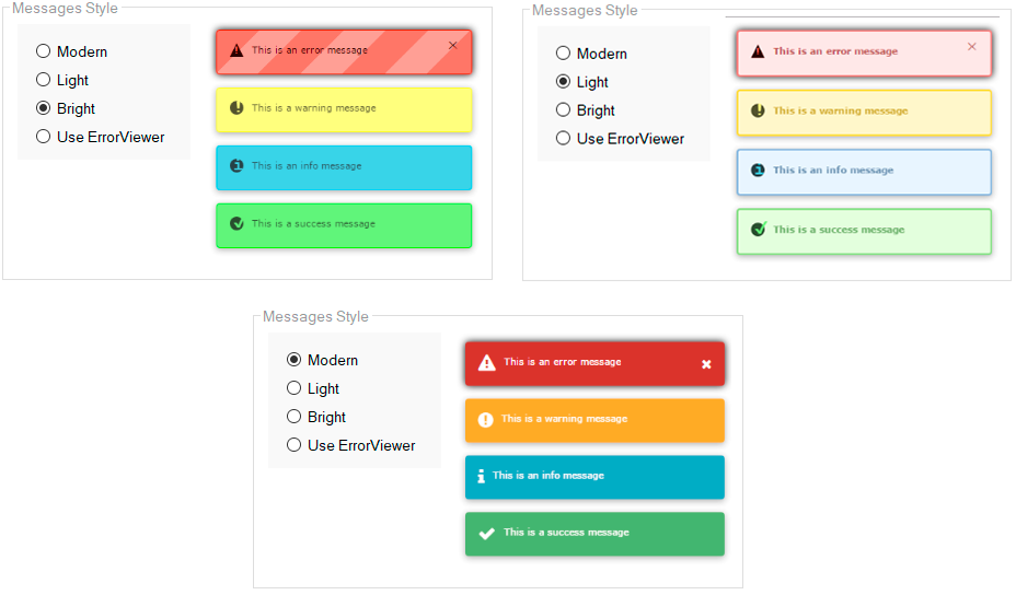
This kind of messages can be used in Transaction in order to replace the default GeneXus messages.
This UserControl provides the possibility to clear all messages that are being displayed in the form. In order to do this, you need to add the following command:
msg("<#CLEAR#>")
First, you must import the xpz, located in the following folder:
<GXDIR>\UserControls\DVelop\DVMessage\DVMessageResources.xpz
After that, in the event where you want to trigger the message you must add the following code:
msg( DVMessageGetBasicNotificationMsg.Udp(!"NameWindowMessage!", "Message description" ,DVMessageType.MessageType, "", DVMessageBoolean.True,"") )
msg( DVMessageGetBasicNotificationMsg.Udp(!"Error!", "Message description" ,DVMessageType.error, "", DVMessageBoolean.True,"") )

- DVMessageType.information
msg( DVMessageGetBasicNotificationMsg.Udp(!"Information", "Message description" ,DVMessageType.information, "", DVMessageBoolean.True,"") )

msg( DVMessageGetBasicNotificationMsg.Udp(!"Regular", "Message description" ,DVMessageType.regular, "", DVMessageBoolean.True,"") )

msg( DVMessageGetBasicNotificationMsg.Udp(!"Success", "Message description" ,DVMessageType.success, "", DVMessageBoolean.True,"") )

In a transaction form, we can validate a field by adding a message next to the field:
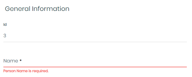
But in a Web Panel, we don't have that behavior.
With DVMessage we can add a message error as in a transaction.
So, you must add an event for the field:
Event <fieldName>.IsValid

    if <field>.IsEmpty()
        msg( DVMessageGetBasicNotificationMsg.Udp(!"Error!", "Message description" ,DVMessageType.error,!"#" + <fieldName>.InternalName, DVMessageBoolean.True,"") )
    Endif

EndEvent
For example:
Event Person_PersonName.IsValid

    if PersonName.IsEmpty()
        msg( DVMessageGetBasicNotificationMsg.Udp(!"Error!", "The name is required" ,DVMessageType.error,!"#" + Person_PersonName.InternalName, DVMessageBoolean.True,"") )
    Endif

EndEvent
So we see it at runtime:

|