
The purpose of Tabular Tab node is to generate a web component with transaction's related information which will be displayed by View object. Tabular tab will display plain information, like information from the transaction itself or from parallel transactions. That is why this object will require at least an attribute as a child.
Tabular Tab node has the following properties:
Tab's caption. Represents either tab's title (in case View's Type property is 'view with tabs') or panel's title (in case View's Type property is 'expanded view')
Internal object's name. It must be unique.
Specifies the condition which will have to be accomplished in order to let this tab visible on screen. It is an optional property.
Specifies the theme class that will have the form.
Web component's name. It is the name that will be assigned to the web component generated from this node.
Specifies the way in which the Tabular Tab will be updated after re applying the pattern. The alternatives are:
- Do not update:
It won't update any of the selection's elements (webForm, Events, Rules) when re applying the pattern. It is like the TabularTab object was no more linked to the pattern, unlike the other objects of the instance.
- Create default:
Each time we apply the pattern, the form will be created and the Rules and Events updated according to the pattern instance. The user code and the content inside user tables will remain intact after re applying it.
- Only events and rules:
Each time we apply the pattern, the Rules and Events will be updated according to the pattern instance, but the TabularTab form will not be created from the instance, it will remain as it was before.
- Overwrite:
Each time we apply the pattern, the Rules, Events and the form will be overwritten. All the content inside user table and the user code will be cleaned.
Specifies the the web user experience of the Tabular Tab object. The options for this property are 'Use model property', 'Smooth' or 'Previous versions compatible'. When the property has the value 'Use model property', it will take its real value from the property 'Web User Experience' of the actual version of the KB:

Specifies whether the base of the Web Form will be HTML or an Abstract Layout. Then, depending on the type of the tables inside the form, the Form may contain some HTML controls or Layout controls. The options of this property are: 'Use model property', 'Abstract layout' or 'HTML'. The value 'Use model property' will take its real value from the property 'Default Web Form Editor' of the actual version of the KB (Image above).


The properties inside this category only applies if property Type from View node is 'expanded view'.
Specifies whether to include a panel which will recover the tab object or not.
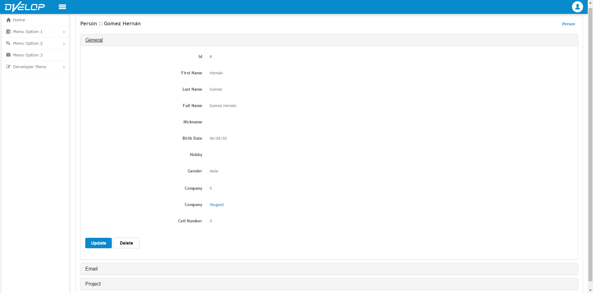
Specifies which theme class will apply to the panel which will wrap the object (grid tab or tabular tab respectively). This property applies only when the type of view object is 'Expanded View'. Using this property you can generate the Expanded View object like the following image (Email and Project are wrapped in panels, and have a different look & feel that the panels in the other parts of the application were they appear):
Specifies whether the panel will have the possibility to collapse or not. This is feature will be used at runtime and only applies if Include in panel is True.
Specifies whether the table will be collapsed by default (when the pages uploads) or will be opened. This only applies if Collapsible is True.
Provides an example of how the TabularTab form will be generated, without the need of re applying the pattern or running our program to picture it.
If you want to read more information about Preview action, follow this link: Preview
|