Character (Att type or control type)

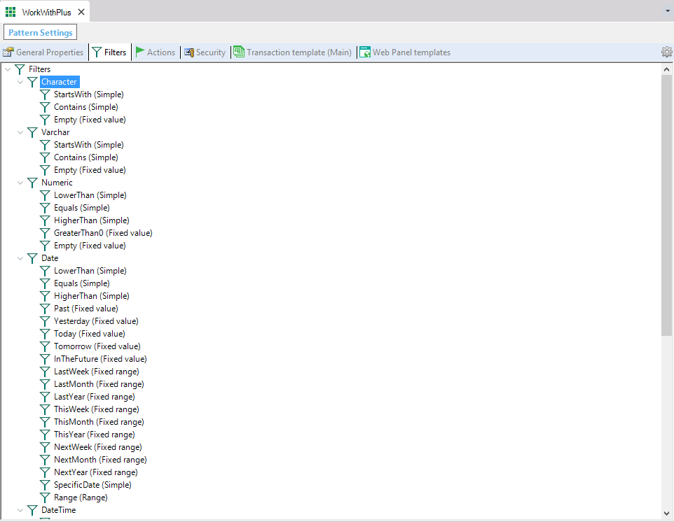
The WorkWithPlus pattern's Filters section in the GeneXus IDE lists filter definitions grouped by data type (Character, Varchar, Numeric, Date, DateTime), showing operators such as StartsWith, Contains, Empty, LowerThan, Equals, HigherThan, and date-specific fixed values like Yesterday, Today, ThisWeek, and Range.

Character node has the following properties:

Category Property  
General Properties Default Operator The Properties panel for a Character filter in the WorkWithPlus pattern shows Grid Title Filter settings: Default Operator "like", Default Operator Type "With dynamic operators", Include Title Filter True, Search Box Single, Data List Dynamic, and Range section with From/To default operators >= and <=.
Default Operator Type
Title Filter Default Operator
Condition Casing
Grid Title Filter Include Title Filter
Search Box
Data List
Allow Multiple Selection
Data List Include Total Records
Data List Update Minimum Characters
Data List Max Values
Range Range Middle Text
Range From Default Operator
Range To Default Operator

General Properties:

Default Operator:

Specifies the operator that will assign by default to all filters based on character attributes. In the example of the image, it will assign as the default operator 'like'.


Default Operator Type:

Specifies the default type of operator that will be assigned by default to filters based on character attributes or when inserting a regular filter.

Value With dynamic operators, by default will insert the following:

A grid title filter dropdown for the "Full Name" column shows a "Search in" label, a "Full Name" field selector, and a value operator dropdown open with "Starts with" (selected) and "Contains" options, next to an empty text input and an add-condition icon.

Value Regular:

A grid title filter row shows "Search in" with the field selector set to "Full Name", the operator set to "Starts with", and an empty value text box with an add-condition icon.

Value Range:

A grid title filter row for a Date attribute shows "Search in" set to "Birth Date", with two date-picker fields (each with a calendar icon) separated by "to", implementing a date range filter, plus an add-condition icon.

Title Filter Default Operator:

Specifies the default operator that will be assigned by default to the title filters.

Condition Casing:

Specifies if it will include in the filter condition a casing condition. The values for this property are None, ToUpper, ToLower. 
 

Value ToUpper, by default will insert the following condition:

A GeneXus condition expression reads: CompanyName (CompanyName.ToUpper() like &CompanyName.ToUpper() when not &CompanyName.IsEmpty()), showing a case-insensitive "like" filter condition applied only when the &CompanyName variable is not empty.

Properties Of Category Grid Title Filter:

Include Title Filter:

Specifies the default value for the attributes of this kind of type (in this example Character). This property in attributes specifies if it will include column title filter or not. All the following properties of this category only applies when this property is True.


Search Box:

Specifies whether these kind of attributes will have a search box inside the column title filter.  The possible values are:

  • None: it won't include a search box
  • Single: it will include one search box
  • Range: it will include two search boxes so that users can filter from some data to other data
  • Date Range Picker: it will use the range picker displayed in the following link: New User Control for Date, Datetime, and Range fields. Only applies for Filters Date and DateTime
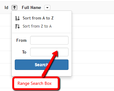
A grid column header dropdown for "Full Name" shows "Sort from A to Z" and "Sort from Z to A" options plus a range search box with "From" and "To" text fields and a blue "Search" button, labeled "Range Search Box" in a red annotation.

Data List:

Specifies whether these kind of attributes will include a list of the possible values or not. The options for this property are:

  • Dynamic: means that it will include a list of real values of this column, and these search will be done on server side, which means that will display values from the current page and from pages that are not visible.
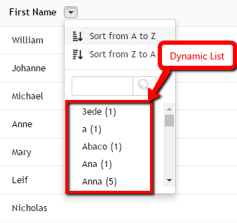
    A grid column header dropdown for "First Name" shows sort options plus a search box and a scrollable dynamic value list (3ede, a, Abaco, Ana, Anna) with occurrence counts, annotated "Dynamic List" in a red callout, over a grid of first-name rows like William, Johanne, Michael.
     
  • Fixed: means that it will include a list of fixed items. This can be used when the attribute contains enumerated values, or is a combo box with fixed items.
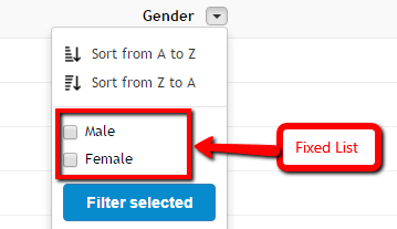
    A grid column header dropdown for "Gender" shows sort options plus a fixed checkbox list with "Male" and "Female" values and a blue "Filter selected" button, annotated "Fixed List" in a red callout.
     
  • None: it won't include a list with possible values for that column.

Data List Include Total Records:

Specifies whether to include next to the data item, the amount of records which have that value. This only applies when the data list is dynamic.


Data List Update Minimum Characters:

Specifies the minimum amount of characters needed to fulfill in the search box, so that the dynamic list updates its values. If the value is 0 means that you can leave empty the search box and the dynamic list will be displayed and updated. This only applies when the data list is dynamic.


Data List Max Values:

Specifies the maximum amount of items to display in the dynamic data list.


Allow Multiple Selection:

Specifies whether the filters associated to the grid titles will have the option to select more than one option from the list or not. This property only makes sense when the property 'Data List' has the value 'Fixed List' or 'Dynamic List'.


Example of property 'Allow Multiple Selection' as True
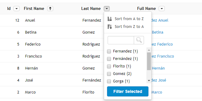
A WorkWithPlus grid shows Id, First Name, Last Name, and Full Name columns with sort arrows, and an open "Last Name" filter dropdown listing checkbox values with counts (Fernandez (1), Fernández (1), Fiorito (1), Gomez (2), Gorga (1)) and a "Filter Selected" button, over rows like Anuel Fernandez, Betina Gomez, Federico Rodriguez.

Example of property 'Allow Multiple Selection' as False

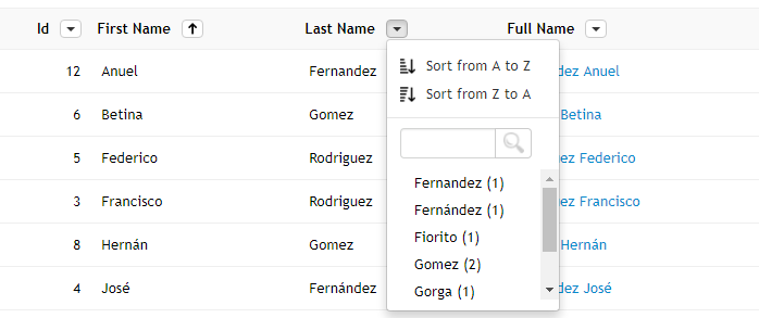
A grid's Last Name column header dropdown is open, showing 'Sort from A to Z' and 'Sort from Z to A' options, a search box with a magnifier icon, and a scrollable value list with record counts such as Fernandez (1), Fiorito (1), Gomez (2), and Gorga (1) for filtering the grid.

Properties Of Category Range:

Range Middle Text:

Specifies the text that will be displayed between the from field and the to field, in a range filter.


Range From Default Operator:

Specifies the default operator for the from field.


Range To Default Operator:

Specifies the default operator for the to field.


If you want to read more information about Column Filters, read the following link: Column Filters

The nodes Varchar, Numeric, Date, DateTime, Boolean and Combo are analogous to this node but for different type of attributes and control types.