Table node has the following basic properties:
Specifies whether the table will be Regular or Responsive. Regular option will display a Regular Table with its related properties. This type of table can be displayed in different ways, depending on the context where it is inserted (just for Ev3, Ev2 is always an HTML Table).
If this Table is Regular and all the Parent nodes are regular Tables and the property 'Base Web Form' of the Web Panel is 'HTML', then this table will be inserted as an HTML Table:
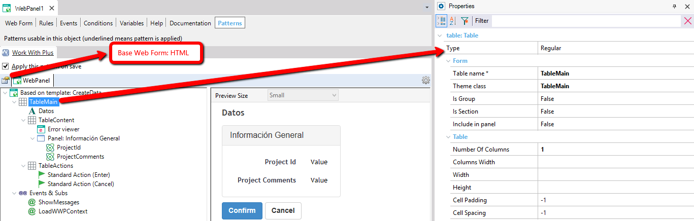
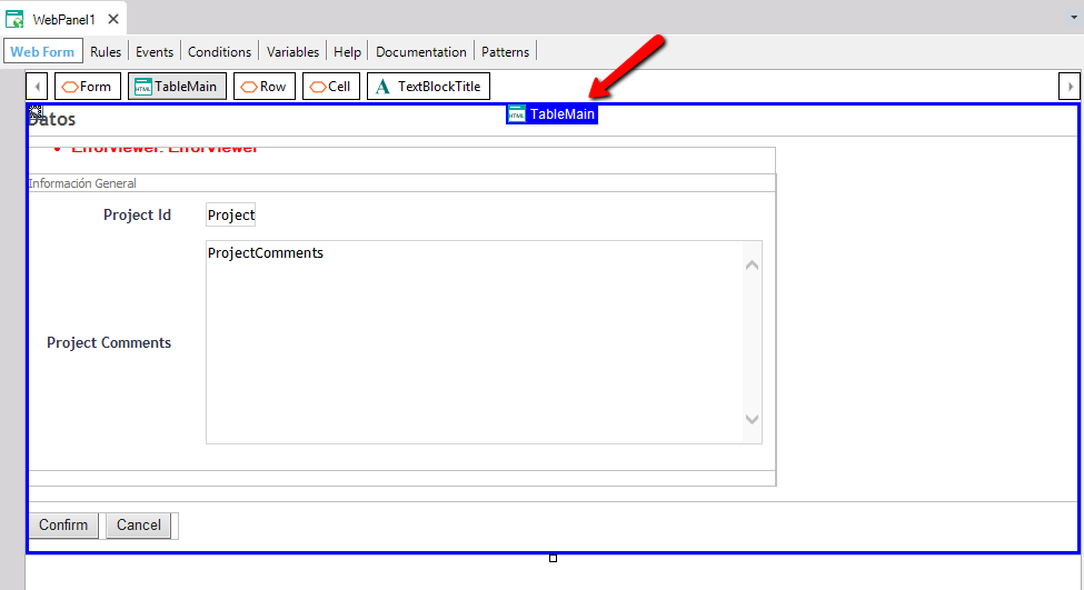
Therefore, the Regular table will be an HTML Table:
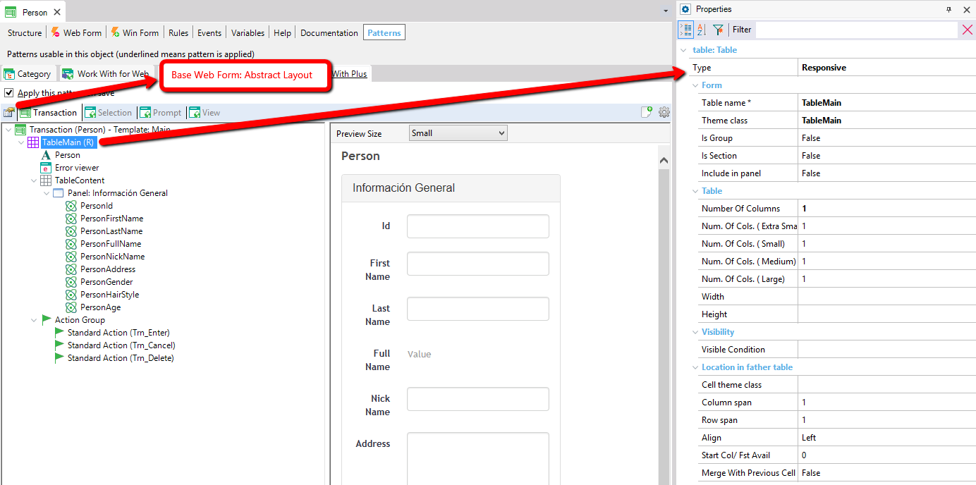
If the Table is regular but is inside a Responsive table, or the Base Web Form property is 'Abstract layout', then the table will be a Regular table in an Abstract layout:
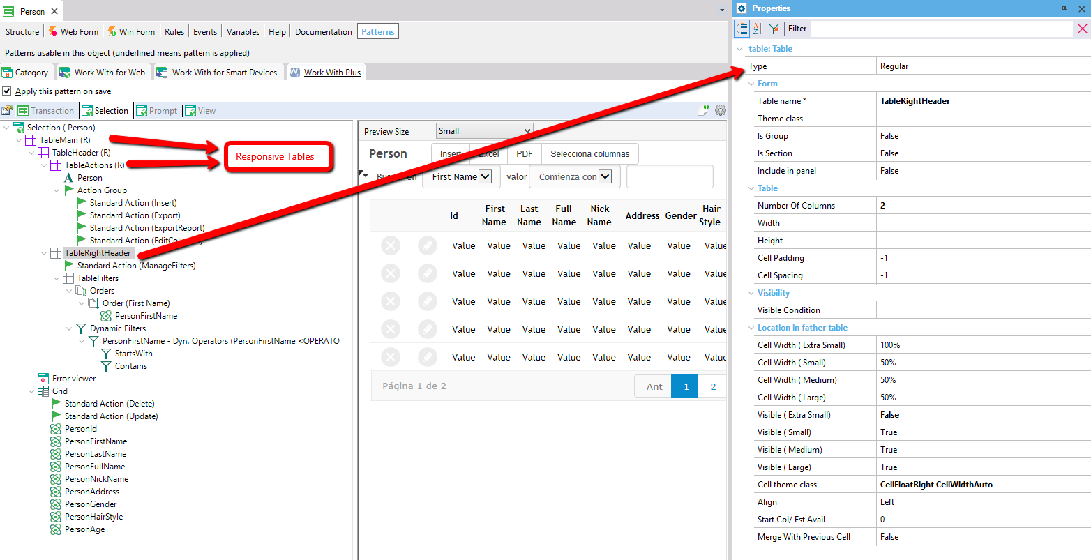
If the Type of Table is Responsive, it will create a Responsive table in the Form, with its related properties. When the property 'Base Web Form' of the object is 'Abstract layout', the table will be inserted directly. However, when the Base Web Form is HTML, WorkWithPlus will need to insert a layout control in order to get inside it the Responsive Table.
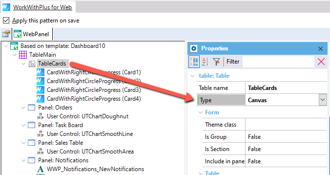
As of WorkWithPlus for Web 15 we include the Canvas type, which will give you better control to organize in layers the content that is inside this type of table.
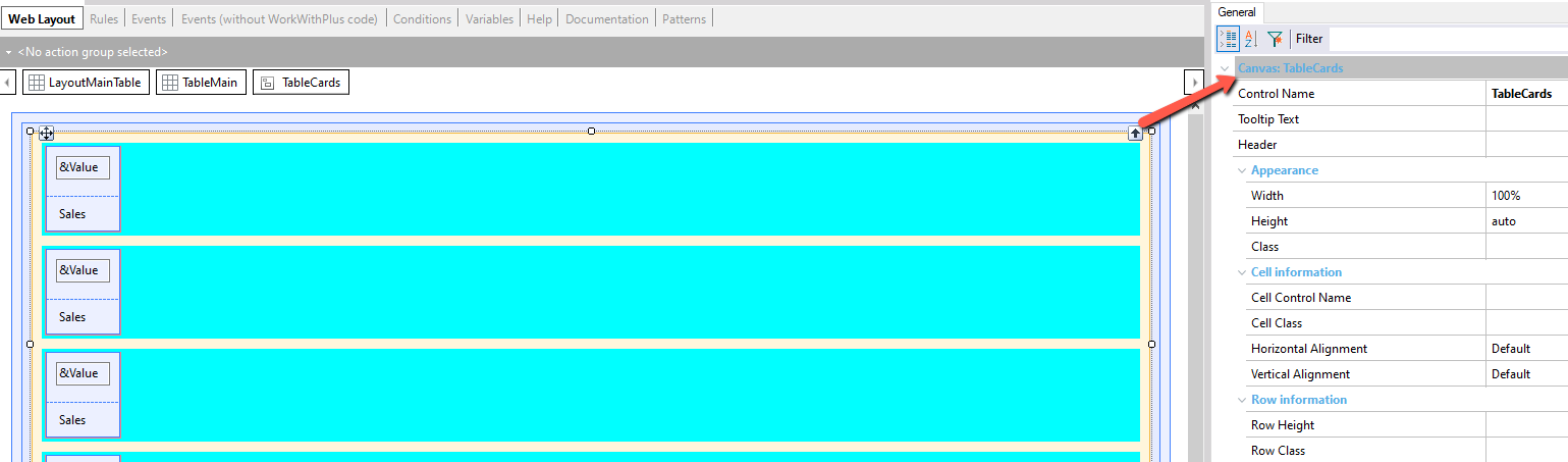
In the Web Layout, the table will be added as a GeneXus Canvas control.
Name of the table.
Theme class of the table.
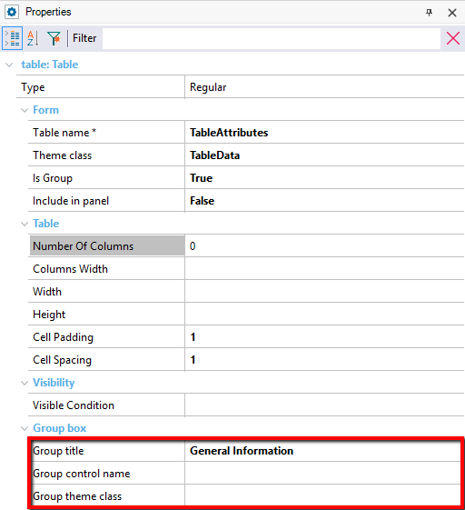
Specifies whether the table is going to be inside a group or not.
If this property is true, a Group box control will recover the table:
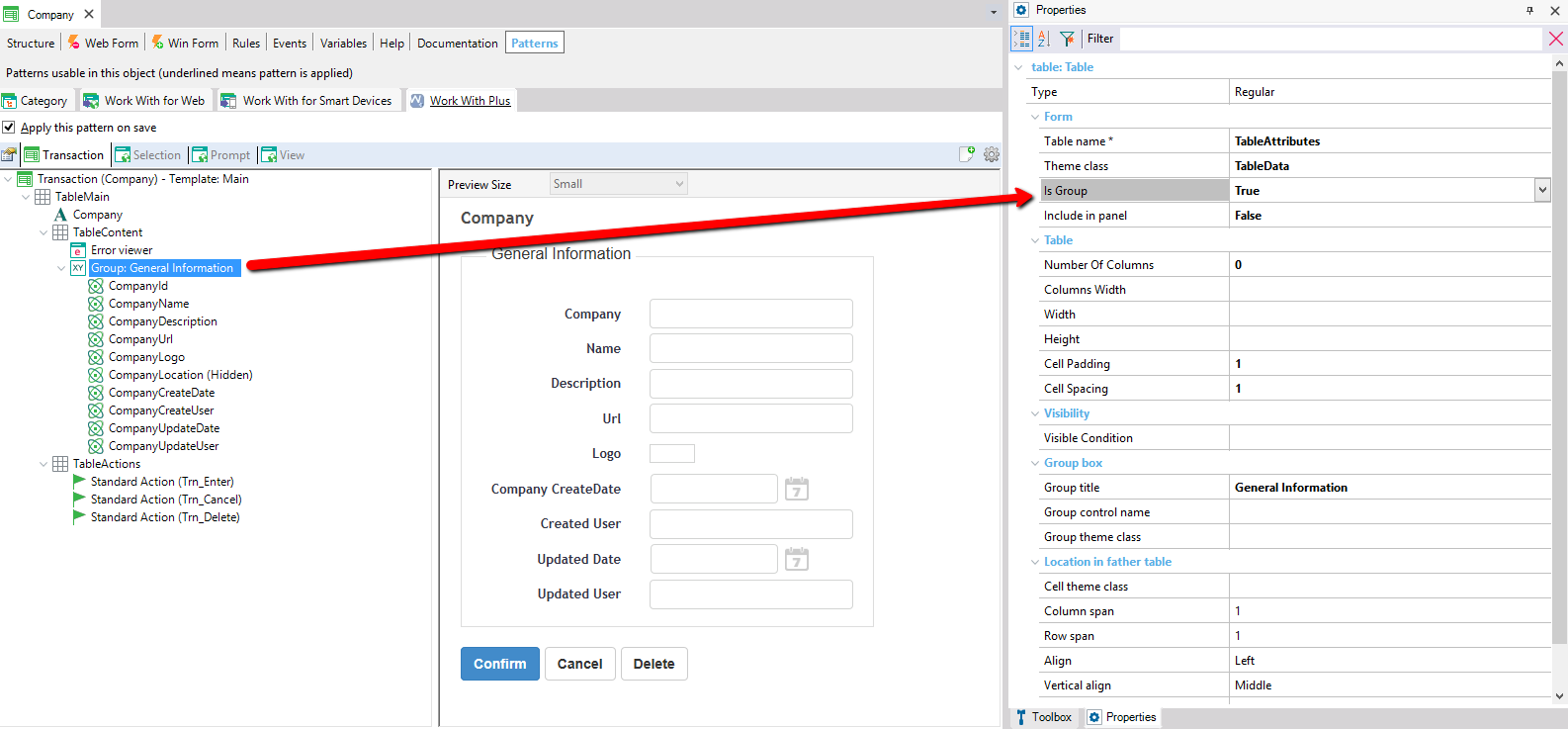
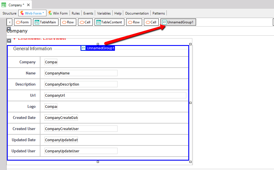
When the property 'Is Group' is true, the properties that are inside Group box category will automatically appear:
Default Z-index value for the items contained within the Canvas. This option is displayed when the Type property = Canvas.
The properties inside this category applies only if the property 'Is group' is True.
Title of the group that wraps the table.
Name of the group.
Theme class of the group. If this property is empty, it will take its value from property 'Group' that is in WorkWithPlus Settings -> Theme Node.
Specifies whether the control will be a section instead of a table. If it is in true, in the web form you will visualize a Section instead of a Table control:
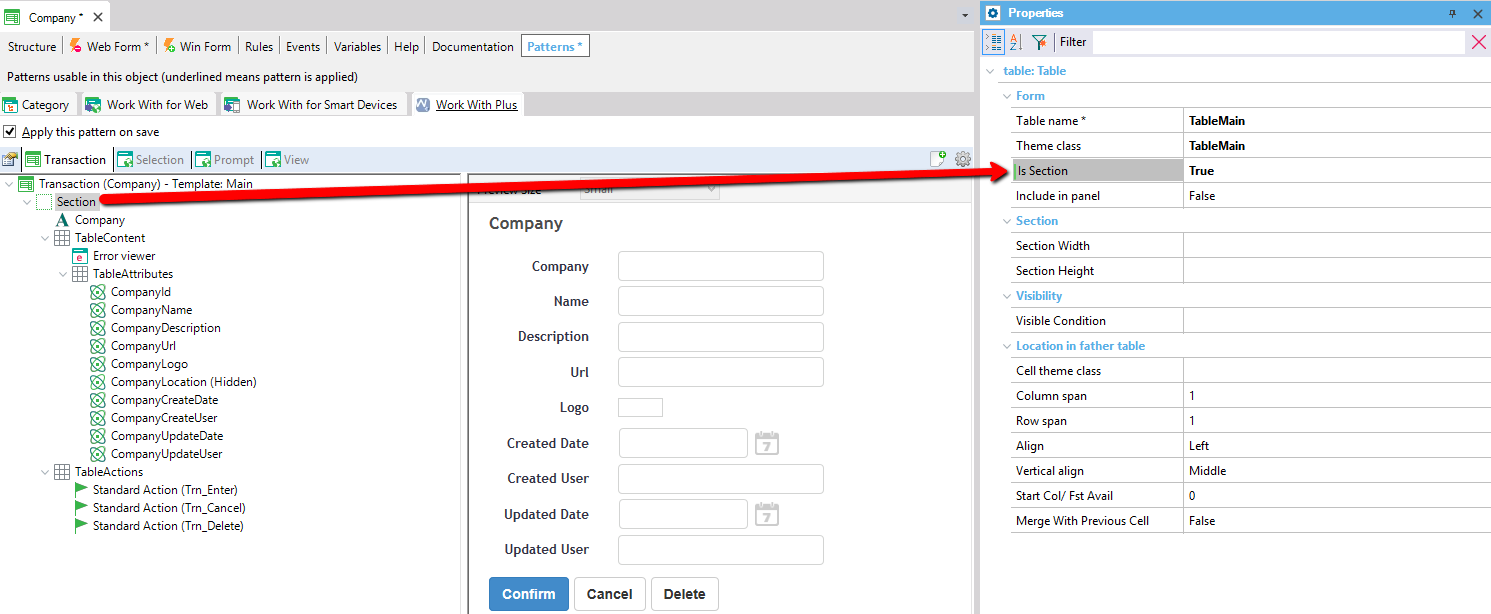
As you can visualize, for Table Name node it added a Section instead of a Table control:
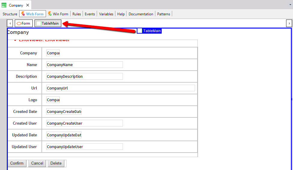
When the property 'Is Section' is true:
- The properties that are in Table category will not be visible because they do not make sense
- The properties that are in Section category will automatically appear:
Only applies when the property 'Is Section' is true
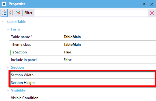
Specifies the width of the section. This property can be a fixed number of pixels or a percentage of the width of the form.
Specifies the height of the section. This property can be a fixed number of pixels or a percentage of the height of the form.
Specifies whether the table is going to be inside a panel that wraps it or not.
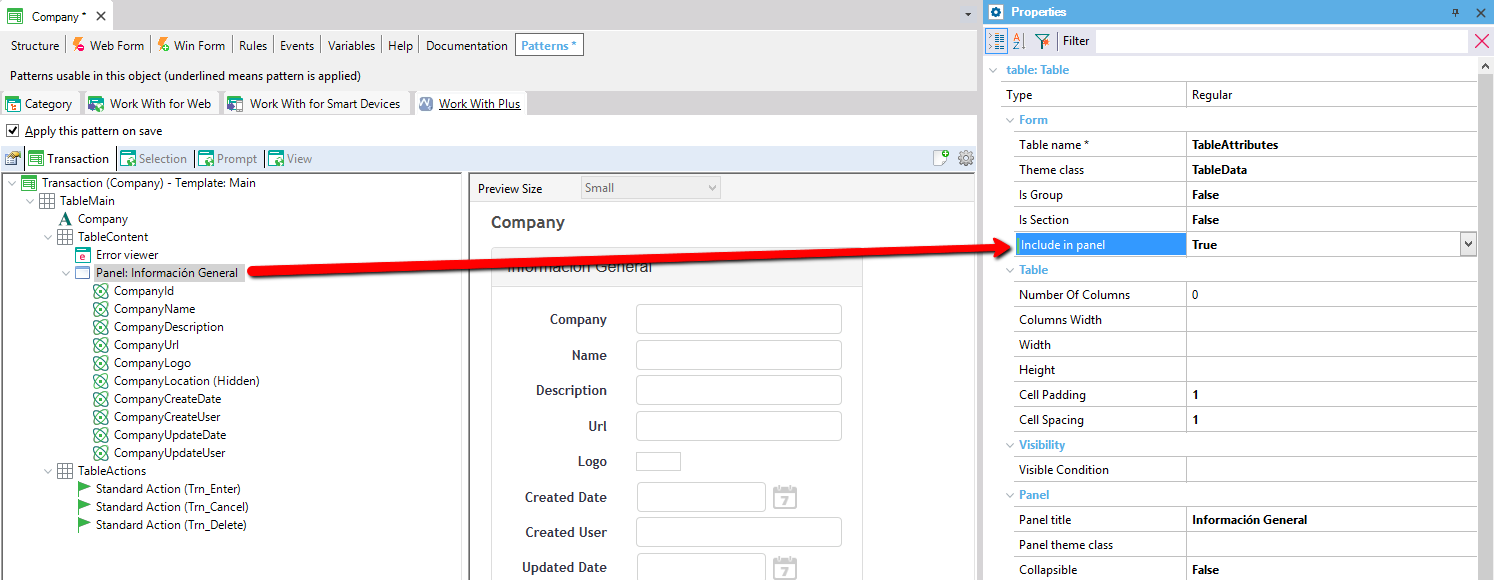
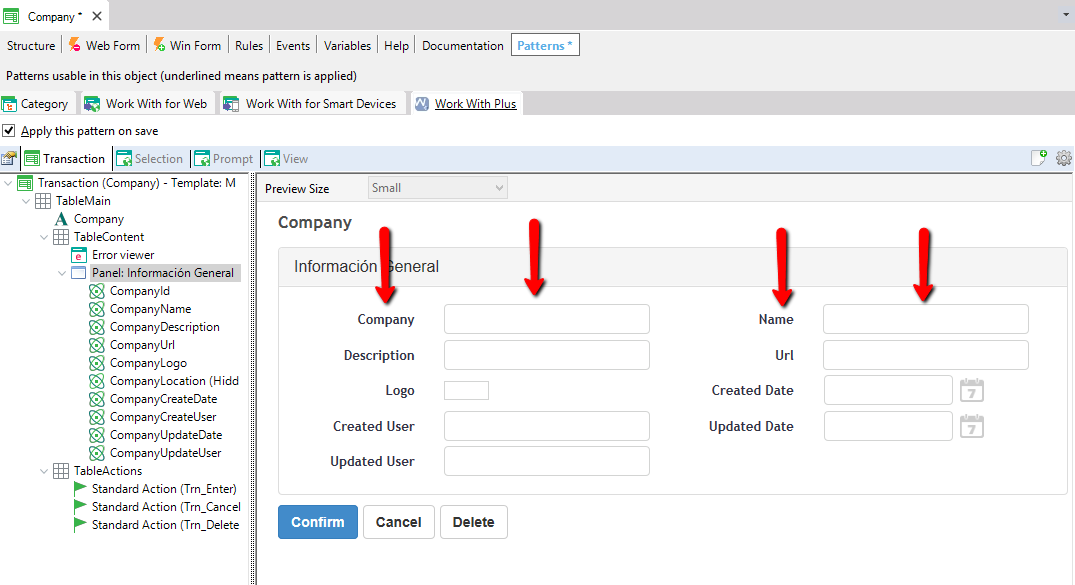
As you can visualize, in the form a Panel wraps the table named Table Attributes:
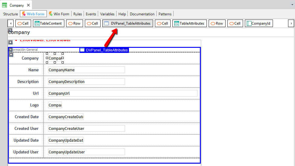
In addition, at runtime you will visualize it like follows:
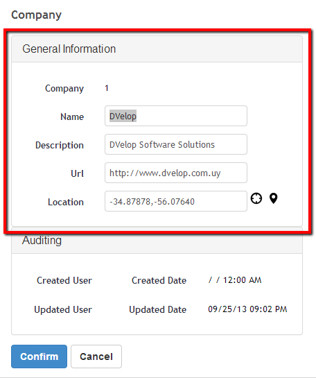
Note: Depending on the property 'Panel Type' that is in WorkWithPlus Settings -> Template node, you will visualize a DVelopBootstrap Panel or a gxui panel when setting the property 'Include in Panel' as True.
When the property 'Include in panel' is true, the properties that are in Panel category will automatically appear:
The properties inside this category only applies if the property Include in panel is true.
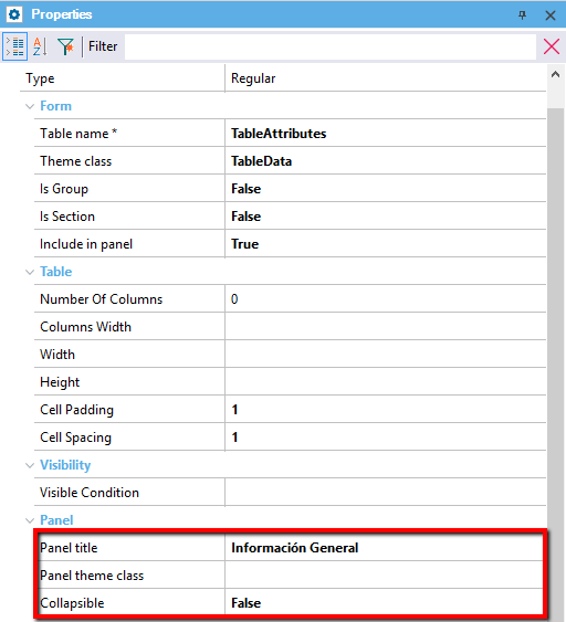
Title of the panel that wraps the table.
Theme class of the panel.
Specifies whether the panel will have the possibility to collapse or not. This is feature will be used at runtime. It this option is true, end users will be able to collapse and expand this panel. You can configure if you want that to collapse and expand panels by clicking in its name (by default is this way) or having a button specifically for it. This is configured in WorkWithPlus Settings -> Template node, in the properties that are within 'Extended Controls' category.
Specifies whether the table will be collapsed by default (when the pages uploads) or will be opened. This only applies if Collapsible is true.
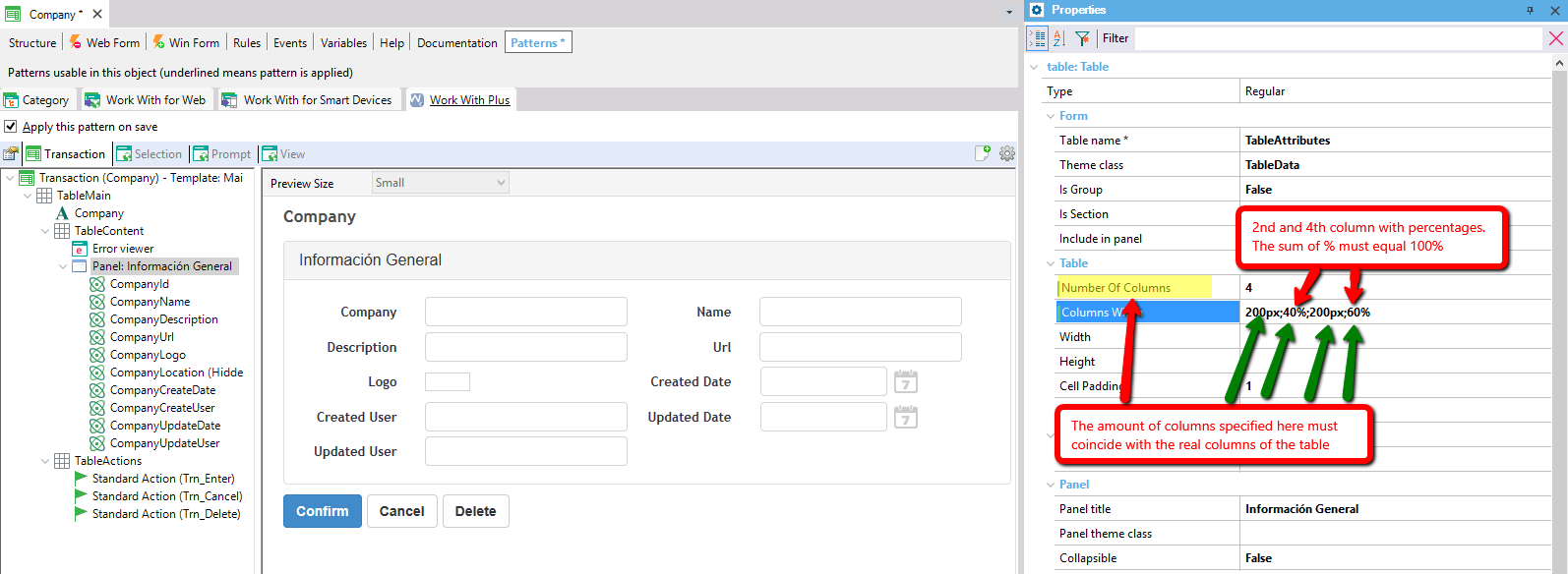
Number of columns of the table, must be higher or equal to one. If this property is zero or one, it will display only one column except when they are controls in it that require at least two columns. For example, an attribute/variable/filter requires two columns because it will display in one column the description and in the second one the field.
Specifies the width of the table. This property can be a fixed number of pixels (168px for example) or a percentage of the width of the form (100% for example).
Specifies the height of the table. This property can be a fixed number of pixels (168px for example) or a percentage of the height of the form (100% for example).
Specifies a condition so that the table/panel/section/group box will be visible only if that condition is accomplished. For example, if you want the table visible just when the mode of the transaction is insert, this property could have '&Mode = TrnMode.Insert'
If you want to read information about the Location in father table properties, follow this link: Location in father table
Depending on the Type property mentioned below, and on the different scenarios mentioned there are some specific properties of each scenario.
Specifies the size of the property Cell spacing.
Cell padding:
Specifies the size of the property Cell padding.
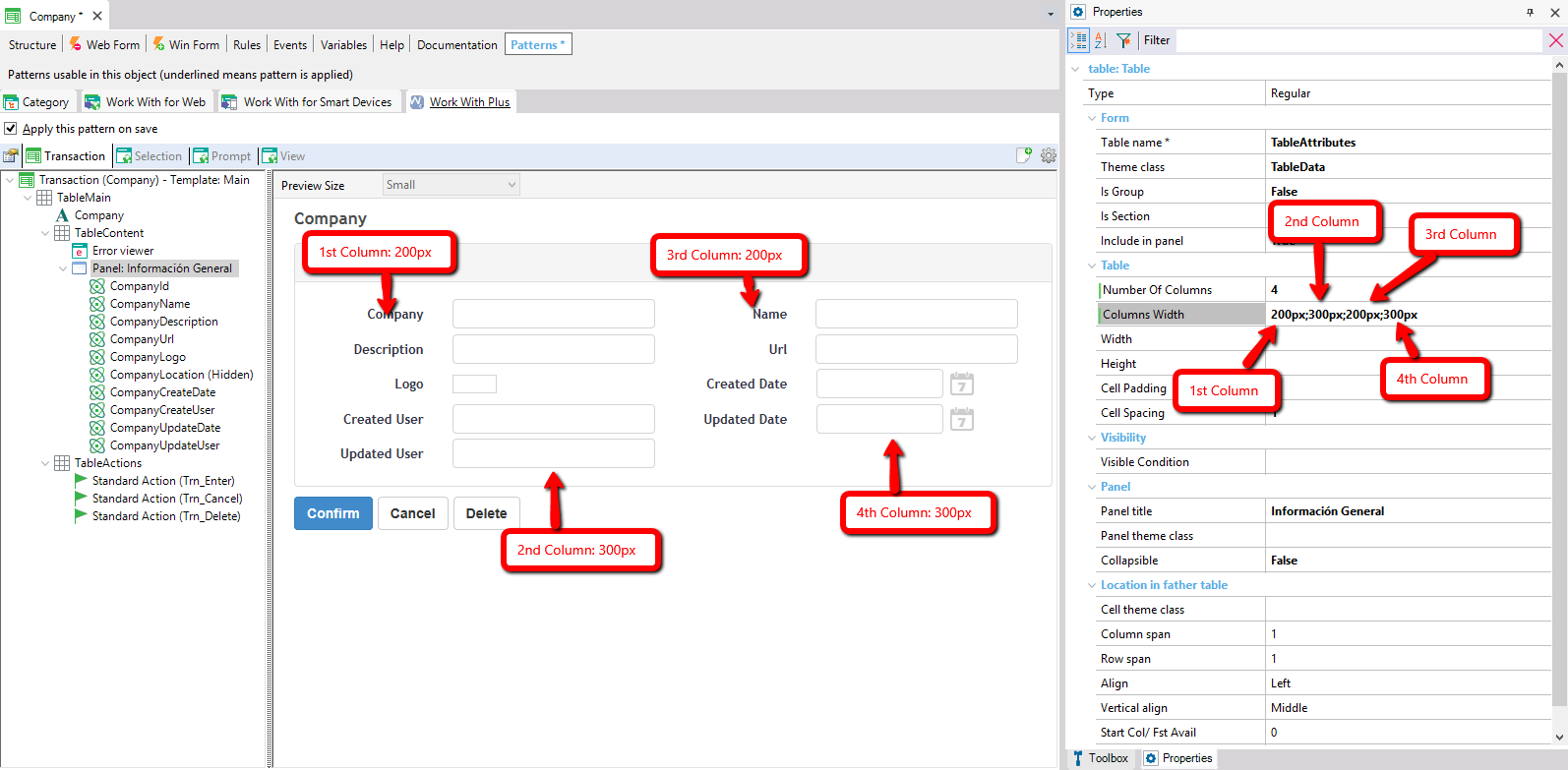
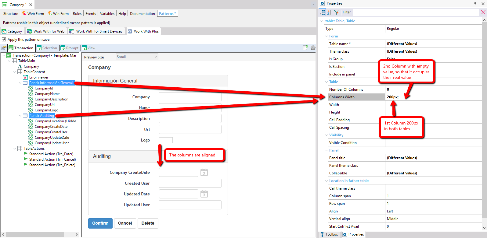
Specifies the width of the columns that are inside the table. Some considerations in this property:
- If this property is empty, each column will not have a fixed width and will occupy what the control and theme classes specifies.
- If you want to use it, you have to set each column width using a fixed value (e.g. 100px) or a percentage (e.g. 20%) separating each column with ;
Examples:
If you have 4 columns in Table node and you want to set some fixed columns to each one you could insert: 20px;30px;40px;10px
You could also set something like: 20px;50%;30px;50%
Or use only percentages: 10%;20%;50%;20%
- IMPORTANT: When you include percentages, the sum of the columns which have percentages must equal 100.
- You can leave some columns with empty value so that they occupy their real value, but the amount of columns defined here must coincide with the real amount of columns that the table has. For instance, if the table has 4 columns and you want to set a fixed value just for the first one you could set: 25px;;; The first one is 25px, the second one is empty, the third one is empty and the forth is empty. Other example, if you want that the third column occupy the 100% and the others to occupy their real value you should set: ;;100%;
This is useful when you need some columns to have fixed widths, or when you need a column to have 100% width and the others to occupy their real width.
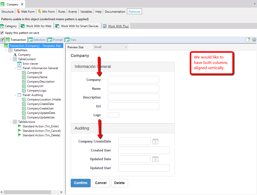
You have two parallel Panels and would like that the first column on both panels get aligned:
Specifies the size of the property Cell spacing.
Cell padding:
Specifies the size of the property Cell padding.
- Num. of Cols. (Extra Small)
- Num. of Cols. (Small)
- Num. of Cols. (Medium)
- Num. of Cols. (Large)
These properties specifies the number of columns that the table will have, for the different browser sizes. The value for this property should be equal or less than the property number of columns general. When you modify the value of this property, WorkWithPlus will automatically update the property Cell Width of all the children that are inside this table. It will update with a default value (dividing the number of columns among the amount of elements in order to set its Width), but you can modify it manually.
|