WorkWithPlus provides the possibility to include Progress Indicators with different styles. This user control is really useful to create Dashboards by combining them with other controls like Charts and Grids.
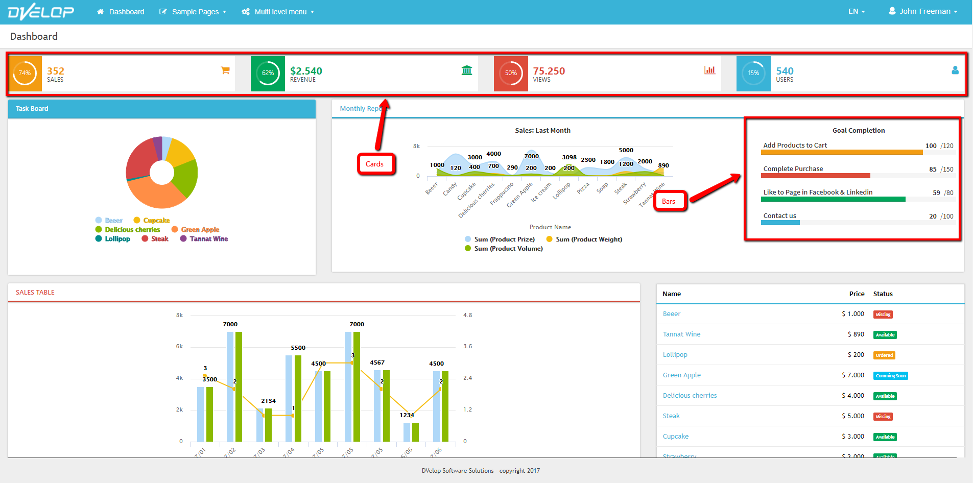
This user control has two available flavours: cards and bars. You can also customize the look&feel of the control and the percentage that will shown.
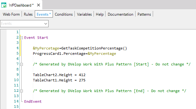
The porcentage can be also set dynamically by adding the following code int the Events tab:
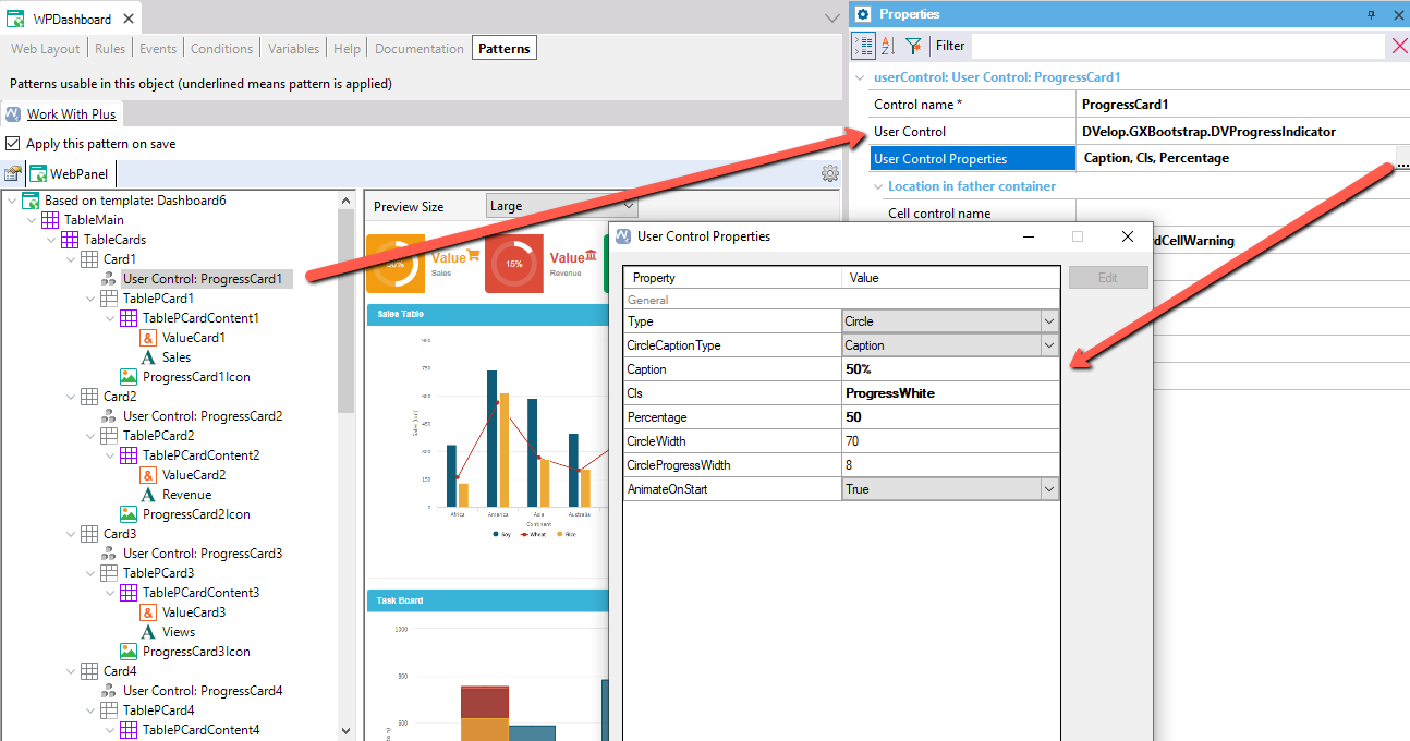
Name of Control Name
DVelop.GXBootstrap.DVProgressIndicator
Two possible values
Caption
Caption and Subtitle
- Enable Caption and Subtitle properties
Raw HTML
Text inside bar or circle
Text shown below Caption. Visible If CircleCaptionType = CaptionAndSubtitle.
It allows inserting html code for the description. Visible If CircleCaptionType = RawHTML
WorkWithTheme Custom Class
Value 0-100 that indicate the progress of bar/circle indicator.
Circle diameter.
Length of the bar inside the parent container.
0%-100% values allowed.
Circle bar thickness.
If show an animation when the control is initialized.
|